Simple affordable chart-plotting app

I've just had a look at the CMAP app - getting very confused now!

Does anyone use this? It looks nice, seems useable, but as always the really useful bits are behind a subscription at £43.49 a year.

Torn now between CMAP, Boating and Orca.....
 
I've just had a look at the CMAP app - getting very confused now!

Does anyone use this? It looks nice, seems useable, but as always the really useful bits are behind a subscription at £43.49 a year.

Torn now between CMAP, Boating and Orca.....
You tend to get a mix of objective information and personal preferences whenever you pose a question like this online so I wouldn't overthink it and just opt for one that appears to suit your needs and give it a go for a year . None are expensive and all are probably on a par in reality. Worst case is that you swap to another in a year's time or even take out another subscription sooner in the unlikely event that you absolutely hate the one you picked.

Edit: Just to muddy the waters I have had Navionics/Boating for a long time and have been happy with it but having just downloaded the free version of the Orca app just to have a look I can see the point made by someone that the charts are clearer and easier to read. I am also considering the Time Zero app as we use this system at work.....;)
 
Last edited:
Yeah you're right. Even if I go with one that doesn't work out, it's only another £50 or so to try another! In fact, I've seem that CMAP offer a free 2 week trial so will save that for when I next go out, and see how it performs :-)
 
Yeah you're right. Even if I go with one that doesn't work out, it's only another £50 or so to try another! In fact, I've seem that CMAP offer a free 2 week trial so will save that for when I next go out, and see how it performs :)

Similarly Orca is also free now as long as you have internet connectivity so you can get a feel for their charts and nav functions.
.
 
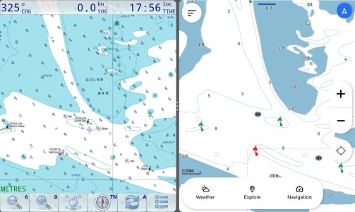
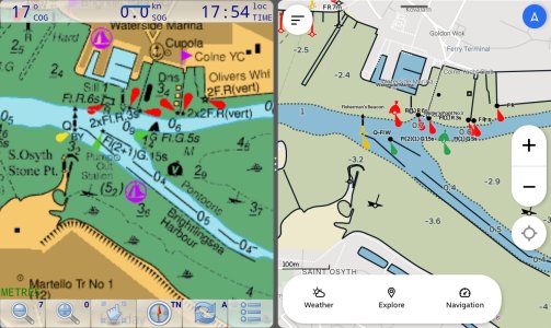
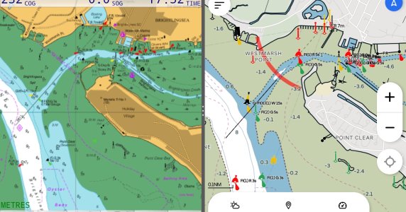
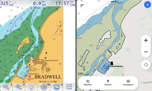
Interested in the positive comments about the Orca app charts so did some comparisons with my existing Admiralty charts from VMH. Orca charts on the right.
1000026685.jpg

1000026684.jpg

1000026683.jpg

1000026682.jpg
 
Thank you Plum, a picture says a thousand words. The Admiralty raster on the left is the best by farm always has been for the last 50 years i have been using them. Is that really the best details you can get with orca? at £25 for the whole of the uk, just about the cost of a G&T!!

David MH
 
Thank you Plum, a picture says a thousand words. The Admiralty raster on the left is the best by farm always has been for the last 50 years i have been using them. Is that really the best details you can get with orca? at £25 for the whole of the uk, just about the cost of a G&T!!

David MH
As the charts on the Orca app are free while you have Internet access so suggest you give them a try. Yes, you do get a tiny bit more detail if you zoom into the Orca charts, typical of vector charts, but in my opinion I don't like having to keep zooming in and out and when you do zoom in the text size gets smaller so I am going to stick with the Admiralty raster charts from VMH and the Marine Navigator app whereby you can download onto 2 devices, for the same price, you get a free chart update for the second year and after that, if you do not pay for the next set of updated charts for the third year you can still go on using the year-2 charts forever.
 
I've been researching navigation apps recently but struggling to find anything that does tidal calculations. I think Savvy Navvy might do it, but only at the highest subscription level. I'm looking at a passage plan across the North Channel (Irish Sea) with a sailing yacht so it's going to be quite important to work out course to steer and the impact on departure and arrival times. I can do it easily on a paper chart but I can't find this in Navionics, Lighthouse, MemoryMap, OpenCPN or any of the other apps I've tried.
Can anyone point me in the right direction? ;-)
 
I can do it easily on a paper chart but I can't find this in Navionics, Lighthouse, MemoryMap, OpenCPN or any of the other apps I've tried.
Can anyone point me in the right direction? ;-)
AngelNav is supposed to have more traditional elements available. It is available on Apple. There were indications that they were working on an Android app for the start of 2024, but this sadly hasn't materialised yet.
 
One point I haven't seen mentioned is that Navionics crowd-sources depth information and for well travelled areas, just twisting the knob on my plotter displays very detailed and accurate depth information. .... and split screen allows simultaneous display of overview and zoomed in. No excuse for hitting the bottom :ROFLMAO::ROFLMAO::ROFLMAO:. .... I still check the entire length of my track though, just in case.
 
One point I haven't seen mentioned is that Navionics crowd-sources depth information and for well travelled areas, just twisting the knob on my plotter displays very detailed and accurate depth information. .... and split screen allows simultaneous display of overview and zoomed in.


No excuse for hitting the bottom :ROFLMAO:
Many more excuses for hitting the bottom I'd say.
Won't bother with endless examples an n-th time, in particular in tidal areas they are unable to provide anything satisfactory, namely because of:
1. Data from people recording depth under sea surface mixed with that of people recording clearance under keel,
2. GPS rollover effect (=incorrect date), which makes depth reduction to hydrographic zero totally random,
3. Using uncorrected depth data altogether: that wipes out entire drying areas, as depth can of course be recorded only when there is some water, islands appear separated when they actually are both inside the drying area,
4. Interpolation/extension of recorded data: try and sail around a tiny feature (islet, promontory, etc) while recording depths, you obviously can't sail over land so the interpolation will simply make the feature disappear from the end chart (which will show water and narrowly spaced contours everywhere, even over the islet)
Anyway, too many past threads about the subject, everyone entitled to his opinions :)
 
One point I haven't seen mentioned is that Navionics crowd-sources depth information and for well travelled areas, just twisting the knob on my plotter displays very detailed and accurate depth information. .... and split screen allows simultaneous display of overview and zoomed in. No excuse for hitting the bottom :ROFLMAO::ROFLMAO::ROFLMAO:. .... I still check the entire length of my track though, just in case.
The Navionics crowd sourced depth stuff was, as I understand it, invented for inland lakes (eg in the USA) which have never been surveyed but have hundreds or thousands of boats using them. Hence gets fairly accurate data.
In Europe most heavily frequented areas are reasonably well surveyed, so the base HO survey depths are generally fine.
Places off the beaten track, with dodgy survey quality, tend to have few boats passing - so the “crowd sourced” depths dont have enough boats to be relied upon.
Hence I keep that layer switched off.
I don't ... because Croatia, and I would wager, most of the U.K. has enough traffic to make it invaluable. My experience in the Adriatic is that is is excellent. It was also very good in Scotland from Oban round the Isle of Mull down to Islay and back, and Thailand around Koh Chang to Koh Kood.

It is additional information which has been collected by boats passing through - dismissing it out of hand is a bit stupid IMO ... look at both sources and believe the one that has the shallowest depth seems a far better strategy than switching one source of data off. Madness IMO.
 
….It was also very good in Scotland from Oban round the Isle of Mull down to Islay and back, ….
That’s pretty much the yachting M25 in Scotland- the busiest locations, and generally pretty well charted by official sources (with a few known exceptions). We generally go a lot more “off piste”
Antares Charts are the undoubted “gold standard” for charts in Scotland- but only cover selected areas. Together with CCC Sailing Directions of course. I will use them, plus Google satellite views, rather than the crowd sourced stuff.

Whatever, you are rejecting a source of data, your choice.

Creating valuable data from crowdsourcing is a science in itself, if you choose to believe it can't work, or will mislead you, then it's your prerogative. Crowdsourcing starts from the base of surveyed data and only modifies with data that is consistent from multiple sources and free of obvious errors and missing or inconsistent data - outliers are excluded. It's an exercise in statistics.

I would encourage anyone sailing in frequented waters to switch it on and compare what it displays with what you actually observe. Technology doesn't stand still, and as I said earlier, believe the one with the shallower depth and always err on the side of safety.
 
There was a good discussion about user supplied soundings. One poster advised that it is still unreliable because of the interpolation that is going on. The poster explained it a lot better. The example he gave was North Korea. Where the soundings are just as packed as the Solent when you switch on community soundings. I don’t think the data density is as comprehensive as the graphics suggests.

No doubt there is some great community depth data. Dive clubs for example are using high end leisure, consumer sonar to map wrecks in the Clyde’s and the detail is stunning which is uploaded to the community dataset.

I think in the digital first age, we should be cognisant of the data and understand the limitations and advantages. For me it can be quite a clutter on the screen.
 
Top