Simple affordable chart-plotting app

How do you get the £45 approx Navionics now for Android? I am seeing £149.99 on Garmin website. Only need Thames Estuary.
 
I'm following this with some enthusiasm as so far I've managed well enough with a paper chart and pencil and am overwhelmed by the apparent complexity and host of options that come with electronic navigation.

Clearly I'm very late to this particular party as I've never actually seen a chartplotter being used let alone had a chance for a play with one myself.

Are there any resources online that demonstrate the function and capabilities of all the various options?
OP here. I am also slightly overwhelmed by the options.

As far as I can tell navionics seems to have many votes.

Can someone tell me what the Visit my Harbour offering is regarding chart plotting? I will only be on the English side of the English channel for at least this season, so maybe its a good package? Can I get charts for use underway with gps from VMH?
 
How do you get the £45 approx Navionics now for Android? I am seeing £149.99 on Garmin website. Only need Thames Estuary.
Not sure what you are looking at, but you download Navionics Boating from within the playstore/appstore then pay for an annual subscription to the maps you want (£39.99).
 
Am I correct in assuming the Antares charts are available in BSB format? And are any of the others available in BSB / S-57 / S-63? (At a reasonable bundled price, that is.)

This may help, from Antares site. BSB is offered as an alternative format too Memory Map but is does not state what the Memory Map format the initial offering is in. Somewhere in another section I read that the chartlets are a geo fenced image in raster. Also KMZ format is offered. Hope this helps, but as you can read, I am only quoting, I don't understand the formats.
ANTARES CHARTS
VERY LARGE SCALE WGS 84 ELECTRONIC CHARTS

BUYING THE CHARTS

The price is £20 for a new set or £9 for an update to your 2023 or 2024 charts.

Delivery is by download

This is a non profit-making hobby—what we charge contributes towards our costs.

You must first decide which navigating software or app you wish to use to run the charts.

We recommend Memory-Map for All (MMfA), available for all platforms, as we like the user interface and as you can also buy the 850 ‘Marine’ charts (effectively UKHO charts) for the UK and Ireland for £25 (annual licence) along with Ordnance Survey walking maps, etc.

Memory-Map for All (MMfA)(requires a device not more than about 6 or 7 years old. The minimum operating system specs are: iOS 13.0 or later; Android 6.0 or later; Windows 10 or later; MacOS 10.14 or later)
Tap here

Memory-Map v6 (for older devices that do not meet the spec for MMfA—see above)
Tap here

For other options:

BSB version of our charts for software/apps such as OpenCPN, SeaClear, Polar Navy or Marine Navigator. There are many such options and we don’t offer detailed guidance but instructions tend to come with the software/apps (but may not!).
Tap here


Google Earth: Those buying our charts in Memory-Map or BSB format will be able also to download our charts in KMZ format for viewing in Google Earth on a PC or Mac (not a mobile device) with a good internet connection, typically at home. See Google Earth setting up guide.
 
Can someone tell me what the Visit my Harbour offering is regarding chart plotting? I will only be on the English side of the English channel for at least this season, so maybe its a good package? Can I get charts for use underway with gps from VMH?
Follow the link that I posted in #5.

What you see is Admiralty style charts of varying scales on screen with your position, COG & SOG. For the details of the navigation software click here.

The Samsung that I purchased comes a number of other apps, a Grib file reader and a GPS Test app, that rather annoyingly only talks about feet and MPH!

The tablet come with a 'full' set of charts, I could happily navigate my way to Barbados, but there is a UK chart set if you are not planning to sail overseas.
 
Can someone tell me what the Visit my Harbour offering is regarding chart plotting? I will only be on the English side of the English channel for at least this season, so maybe its a good package? Can I get charts for use underway with gps from VMH?
VMH offer a full set of raster charts for use with an app called Marine Navigator, as a plotter. You can use the internal GPS, or connect wirelessly to the ship's system, if that is option is open to you. If you can, AIS could be available as an overlay.

The charts you buy from VMH are yours forever (or as long as the life of your devices!), so you can update as you feel you want to. Couple of options for coverage: NEW 2025 Android Charts : by VisitMyHarbour [Android: Marine Navigator Charts] - VisitMyHarbour articles
 
I don't like the sound of savvy navvy because apart from the negative reviews, automated passage planning does not appeal to me. I just want the simple ability to draw points and lines, and see myself as a small dot, on an on-screen chart. I will plan routes myself in advance according to tides and conditions.
No experience of savvy navvy but I do have Navionics (so another vote for that) and whilst it too has an automated route function you can also plot routes and waypoints manually. I would be surprised if savvy navvy doesn’t let you do the same but as I said, I have never used it.

Navionics is relatively cheap for U.K. Ireland & Holland, which also appears to cover the Channel and north coast of France and I have the app on both my iPhone and iPad for no extra cost.
.
 
OP here. I am also slightly overwhelmed by the options.

As far as I can tell navionics seems to have many votes.

Can someone tell me what the Visit my Harbour offering is regarding chart plotting? I will only be on the English side of the English channel for at least this season, so maybe its a good package? Can I get charts for use underway with gps from VMH?
It want simple cheap with raster charts also try MemoryMap for All app, which I think does everything VmH does
 
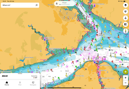
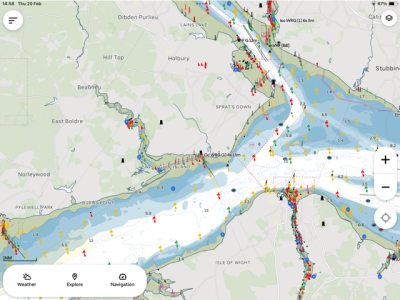
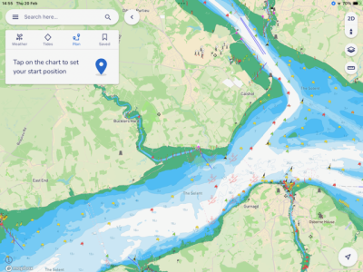
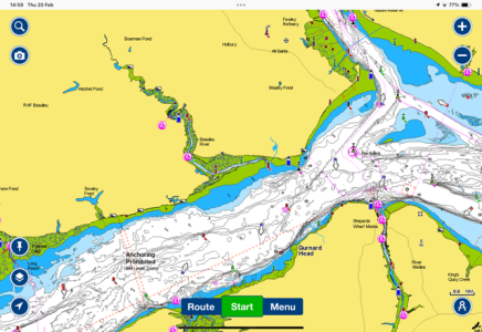
I've tried Navionics, Savvy Navvy, Orca, and B&G companion which is CMap. Orca is still a work in progress. Savvy is a lot better than it was. Navionics is good. It has the best routing (not that I'd trust any of them) but is the most expensive.
My favourite is the B&G/CMap. It is the easiest to read, it's easy to manually enter a route or adjust an automatic one. You can have multiple devices signed in. There is a free version (I'm not sure how much you get to access) but the premium version is £42.99 with world wide mapping. You don't need to have B&G electronics to use it.
 
Another happy OpenCPN user. A little bit fiddly to load charts but the clearest and simple operations. Sometimes slow when the view includes many chartlets but I have no problem with that.
I initially plugged in an AIS and my Garmin 72 through a USB converter cable but now use a Standard Horizon VHF.

I use it for confirming my position, clearance lines when concerned, and, if necessary, identifying names of ships.
Another vote for open cpn. I subscribed to the VMH offer of full uk admiralty chart set.

The opencpn AIS anticollision graphic representation puts most commercial offerings to shame.
 
Clearly I'm very late to this particular party as I've never actually seen a chartplotter being used let alone had a chance for a play with one myself.

Are there any resources online that demonstrate the function and capabilities of all the various options?

I don't know of a comprehensive comparison, but there are plenty of resources for each individually. But for a brief primer...

The charts
Ideally charts are separate from the app, so you can used the best charts with the best app, but unfortunately that's rarely the case. Most charts are likely re-selling HO data. I suspect the number incorporating their own data are very few in number. Navionics does, and it sounds like Antares is largely privately-sourced as well. The UK seems an outlier in having specific leisure offerings (harbour details, etc), but it sounds like it may be reasonable to consider those offerings (VMH, etc) in a similar category?

What's in common
Nearly all function mainly as chart viewers; the interactivity is largely limited to adding routes, waypoints, zooming, and panning the display. People speak of objects appearing and disappearing as you zoom in and out; it's little different from if you were to swap in a more detailed paper chart: many items remain the same, some will be added or removed.

The general practice, if you want more information on an object (e.g. bridge information), is to select it and view the info in a popup. This differs from what you're used to with paper, though some offerings (esp. Navionics) do tend to include more text on the chart itself.

Waypoints are point positions, routes simply connect points, and the plotter can tell the autopilot to follow a route (which is really just steering to different waypoints in succession).

Most allow the setting of at least a safety depth, used to control the depth shading, so you can tell "safe" water at a glance.

If you want to "mark up" the chart, you are largely limited to adding a waypoint and giving it an appropriate name (e.g. "buoy missing"). Some apps allow you to select from a range of icons.

Other nice features are the ability to overlay a radar image on the chart, and also display AIS information. Here again you'd typically query an AIS object to bring up details (ship name, dimensions, heading, speed, closest point of approach, etc).

All of that is fairly standard, and the main differences would be in presentation and UI: the colours, the icons, the specific method of creating a route, the menu structure for adjusting settings, etc.

What's less common
Some offerings include 3D presentation of the bathymetric contours or the ability to add satellite imagery. Navionics offers "sonar charts" which are crowd-sourced data that is often more detailed than the standard charts. In popular areas this can be useful, in remote areas use caution (it may be interpolated and not real).

Many apps offer some form of measuring tool: you can select two points and it will show the bearing and distance to one from the other.

Very, very few offerings allow marking out areas (e.g. "safe" or "unsafe" areas) and setting entrance or exit alarms. Similarly, very few allow plotting LOPs or range circles.

Only a few have "good" AIS display, by which I mean displaying ticked course vectors, a visual CPA, and true-scale icons when zoomed in. Most display triangles, often coloured by vessel category (tanker, cargo, tug, leisure, etc).
 
This may help, from Antares site. BSB is offered as an alternative format too Memory Map but is does not state what the Memory Map format the initial offering is in. Somewhere in another section I read that the chartlets are a geo fenced image in raster. Also KMZ format is offered. Hope this helps, but as you can read, I am only quoting, I don't understand the formats.
Thank you! Yes, I spotted the mention of BSB and KMZ there, which is why I perked up. I tried to see what Memory Map used without much luck either, it's possible they're using a standard format with a copy-prevention wrapper around it.
 
@Jodel I think thats a really nice comparison of the charting. To my eye other than the size of the bouys etc (which may be a setting in some) there isn't really a major difference on those other than personal preference. But there are definitely differences in usability which are things like knowing how to find settings, how to add AIS etc and how that's displayed etc. Tidal data probably matters to most of us to some extent - so the ability to see that now, and if you are using it to plan at a future date/time is also helpful.

Am I right in saying none of these offer the means to communicate back to your network? e.g. to tap on a AIS target and have its MMSI sent to the radio?

Another happy OpenCPN user. A little bit fiddly to load charts but the clearest and simple operations. Sometimes slow when the view includes many chartlets but I have no problem with that.
I must be missing something but if I have say 8 chartlets all available (different scales area etc) is there some way to know which one is the one I probably want? Each is represented by a coloured rectangle, but I find I have to tap through them unsure if my finger has registered waiting for the page to load till eventually the option I want appears? MM users? do you have similar issues for Antares like this?
 
Navionics offers "sonar charts" which are crowd-sourced data that is often more detailed than the standard charts. In popular areas this can be useful, in remote areas use caution (it may be interpolated and not real).
Here
Here on the west coast of Canada, Navionics "sonar charts" are usually a joke. Just interpolations from widely-spaced official soundings. Not real. Not useful. Navionics does update its standard charts as frequent as official CHS updates... I've seen newly-found rocks/shallows/wrecks take a year to show up on Navionics.
 
I must be missing something but if I have say 8 chartlets all available (different scales area etc) is there some way to know which one is the one I probably want? Each is represented by a coloured rectangle, but I find I have to tap through them unsure if my finger has registered waiting for the page to load till eventually the option I want appears? MM users? do you have similar issues for Antares like this?
I've only used OpenCPN on the laptop, where I believe mousing over should provide a pop-up with scale details and highlight the coverage extent. However... my preference is not to use those at all!

While you could use them to e.g. swap between an MM chart, an Antares chart, an Admiralty chart, etc, the rectangles mix both chart types and chart scales. Thus, I'd instead define an Antares chart group, an MM chart group, etc and toggle between those. To change scale I'd simply zoom in and out just as one does on the other apps, allowing the app to jump to the more appropriate chart.
 
I've only used OpenCPN on the laptop, where I believe mousing over should provide a pop-up with scale details and highlight the coverage extent. However... my preference is not to use those at all!
Yea I’ve used it on a desktop and I think you are right mouse over worked as you describe but the mobile app is obviously a desktop app ported to android without IMHO a touch interface design.
While you could use them to e.g. swap between an MM chart, an Antares chart, an Admiralty chart, etc, the rectangles mix both chart types and chart scales. Thus, I'd instead define an Antares chart group, an MM chart group, etc and toggle between those.
I’m not near the tablet, any idea how you create a group or tab?
To change scale I'd simply zoom in and out just as one does on the other apps, allowing the app to jump to the more appropriate chart.
 
Top