dgadee
Well-Known Member
What is the dotted line on the chart indicating in Dunstaffnage? I have looked in Chart 5011 and can't see what a dotted line without symbol or text could mean.

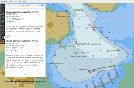
According to Chart 5011 there should be the word 'moorings' associated with such an area. I am using OpenCPN and o-charts and looked at the texts (right click) but didn't see that 'Numerous moorings ...' Where is that to be found? I notice the dotted line goes through the marina pontoon."Numerous moorings exist in this area. They may not all be shown and may be privately owned. Usually they are located inshore and unlit."
The dotted line is a generic symbol to indicate an area.

So are you sure you are actually looking at an “Admiralty Chart” - what exactly is the source of the O-Charts you purchased (NB. I think I know the answer to that, but not certain).According to Chart 5011 there should be the word 'moorings' associated with such an area. I am using OpenCPN and o-charts and looked at the texts (right click) but didn't see that 'Numerous moorings ...' Where is that to be found? I notice the dotted line goes through the marina pontoon.
Antares doesn't have that line.

I use o-charts too. The pink (to my eyes) broken line that you are seeing is only shown when I select "Show ENC Anchoring Info".......... I am using OpenCPN and o-charts and looked at the texts (right click) but didn't see that 'Numerous moorings ...' Where is that to be found?
Google maps or better still Apple maps aerial view. You can often see clean and sandy seabed in water where there's still 3 metres at low water.How are you supposed to choose a spot to anchor from a chart if you don't know whether it is sand or rocks? At least Navily and suchlike have some indication.


If Google maps doesn't show much look at Apple maps, it's often better. Apple device not required.OpenCPN on my phone let's you switch between Google maps and the charts. Very handy.
I don’t believe that is entirely the case.The data on leisure charts is not assured to the standard that ENCs from a hydrographic office are, which is one reason the plotters state that they are not to be used for navigation. Savvy Navvy did not include a layer of data which showed fish farms and overhead power lines. This was brought to their attention and they said that they will correct. The point is, leisure, consumer navigation charts, may not show data derived from hydrographic office data sets or even show the data compliant with a recognized standard e.g. Navionics rock symbol is black cross with background of red dots in a matrix. It couldn’t be more shite if they tried. The rock awash symbol is the same as UKHO.
The o-charts do have some information on the nature of the sea bed as you can see from the picture in post #9.Another point about these charts. The old bw ones had much more information on the nature of the seabed. The current ones (even Antares) have much less detail, if any at all. How are you supposed to choose a spot to anchor from a chart if you don't know whether it is sand or rocks? At least Navily and suchlike have some indication.
Kearstay.
As does the UKHO raster chart shown in post #5. Basically from the same source.The o-charts do have some information on the nature of the sea bed as you can see from the picture in post #9.