Open CPN, UK charts. Admiralty & alternatives

Go on, tell us how much it would cost per annum to buy all these Solent charts shown there (not just the 1:200k planning chart, which doesn’t have enough detail)

Indeed, it's a bit much at close to £800! :ROFLMAO:

Imagine 3.5mm fonts on Navionics on a phone !!
Fortunately I rarely need to view my phone from a metre away! The "big" font, as lustyd showed, is just over 2 mm, and 1.5-2 does seem a much better range for phone viewing.
 
The "big" font, as lustyd showed, is just over 2 mm, and 1.5-2 does seem a much better range for phone viewing.
It's 3mm on my phone (iPhone 14) so once again shows it's a software thing. In this case very likely linked to system font size on the phone. Edit - no it's not linked to system font size 🤷‍♀️ Apparently accessibility still hasn't caught on
 
I wouldn't be entirely surprised if they hard-coded it in pixels or something, because who would expect a phone to have a screen size of 1080 x 1920?
 
This is an interesting discussion and despite it being some months since the last post I will contribute two personal experiences and some info from our Owners Group.

On a passage to Guernsey last month our expensive marine computer failed without any warning. We switched the autopilot to "Auto" mode and completed the passage safely using our paper charts. My wife and I won't sail without them. When the last editions of the Admiralty charts for our cruising area are published we will raid the pension fund and buy a set, which will see us out.

On the failed computer our Operating System was Windows 7, our chartplotter software was OpenCPN, and our charts were VMH Admiralty raster. The replacement computer is a cheap but very good Asus PN51 on which the OS is Linux (Ubuntu), and we still use OpenCPN, but VMH charts won't work on Linux. I have therefore purchased O-Charts vector charts. They are not as good as the Admiralty charts for navigating close inshore, in estuaries, and rivers. I am writing this while anchored opposite Smugglers Cottage in the River Fal and doing a pilotage plan for a trip in our RIB up the Tresillian river. The Admiralty paper chart (and the raster version running on a Windows tablet) is a clear winner for that. And the Ordnance Survey Landranger paper map is also useful for that sort of thing.

I am not saying that I am right and everyone who supports the exclusive use of electronic navigation and vector charts is wrong. I'm just saying what my experience has been and what I personally prefer for the sort of thing we do in our boat.

Finally, concerning zooming and the display of hazards at different levels of zoom. In the 10 years we have owned our boat there have been several reports on our Owners Group about this, including one total loss of a USD$2million vessel due to a hazard not being displayed effectively at the selected zoom level. There was the famous grounding of Vestas Wind in 2014 due primarily to complete reliance on electronic navigation, significant hazards not appearing at all levels of zoom, and an incorrect zoom level being selected by the navigator. And I saw this recent report: Hit a rock in remote SE Alaska with the interesting comment: 'Large area raster charts will often show small, but significantly hazardous rocks that won't appear on any vector chart until zoomed well in regardless of setting - because the cartographer knows they are significant to boat navigation, the computer hasn't a clue.'
 
And I saw this recent report: Hit a rock in remote SE Alaska with the interesting comment: 'Large area raster charts will often show small, but significantly hazardous rocks that won't appear on any vector chart until zoomed well in regardless of setting - because the cartographer knows they are significant to boat navigation, the computer hasn't a clue.'

Two things worth calling out from that story:

1. "Standard" display comes from the ECDIS world and is relatively sparse and doesn't include things like rocks. That's because it's expected the user will have been trained on the usage of ENC charts and will be using the isolated danger symbols along with safety contours to keep in safe water. However, on occasion it's necessary to cross the safety contour, in which case enabling either "isolated dangers in shallow waters" or "rocks" suddenly becomes very important.

From the report: "The chart issue (pics below) was interesting. I was using the vector preset setting "Standard". I was surprised to learn that "Standard" does not include rock symbols. I should have picked up on that sooner. I'm not sure when/why it got changed, but it was a bit of a surprise."

Takeaway: when using ENC charts, the untrained user should set the display to "All".

2. Regarding "Large area raster charts will often show small, but significantly hazardous rocks", this is a cartography issue. Each object, rocks included, has a defined scale at which it appears. It has nothing to do with the computer not knowing, but rather the cartographer deciding it's not significant enough to display on a larger area chart. For example, the shoal Vestas hit is plotted on the UKHO ENCs and practically visible from space:
6b8e60c3032f62968a52d9342d66d574b8397cc4.jpeg
 
because the cartographer knows they are significant to boat navigation, the computer hasn't a clue
This is simply nonsense. The cartographer is following a set of rules that very easily translate to computers.
Some poor implementations do not mean implementation is impossible.

Just like an out of support and overly complex Windows PC breaking isn’t an indicator that electronic navigation is unreliable. I’d have to lose 6 systems before I even consider using one of the computers on board, and even then I’d have four options before paper (which I don’t have, because we cruise too far for paper to be practical).
 
....That's because it's expected the user will have been trained on the usage of ENC charts

Just a thought - have we become overconfident about our use of charts? We just buy them and use them without any training. When we start boating and do our Day Skipper or Yachtmaster courses we do learn about charts - but we don't learn about every system or every publisher. When I elected to use primarily Admiralty charts I bought a copy of the "Symbols and Abbreviations" book and have needed it several times. But I know nothing about O-charts, I just bought them and am using them with no knowledge of how data is presented. I'm just learning as I go along.
2. Regarding "Large area raster charts will often show small, but significantly hazardous rocks", this is a cartography issue. Each object, rocks included, has a defined scale at which it appears. It has nothing to do with the computer not knowing, but rather the cartographer deciding it's not significant enough to display on a larger area chart.
Is that really how it works? Do the electronic chart publishers employ cartographers who study in minute detail the way hazards are presented? I suspect that presentation of data at various levels of zoom is decided by algorithm. Perhaps AI will enable better decisions about which hazards to display at ALL levels of zoom. Maybe.
 
This is simply nonsense. The cartographer is following a set of rules that very easily translate to computers.
Some poor implementations do not mean implementation is impossible.

Just like an out of support and overly complex Windows PC breaking isn’t an indicator that electronic navigation is unreliable. I’d have to lose 6 systems before I even consider using one of the computers on board, and even then I’d have four options before paper (which I don’t have, because we cruise too far for paper to be practical).
Implementation is only possible if it is financially practicable for the electronic chart publisher. I suspect that there are financial constraints which affect the quality of charting available to the leisure user at consumer prices.

Your cruising sounds entirely different to mine. I crawl around creeks and bays, mainly in the South West and East Coast of England, the Channel Islands, and Ireland. You're welcome to dispense entirely with paper charts. I won't.
 
I have paper charts for those areas, we put them in storage as we’re not in those areas often. It would be financially impossible for us to buy paper for everywhere we go, even if we could physically store so much paper on board. Realistically for cruising that space is better filled with tools and spares so address real problems.

Of course it would be financially practical, it’s just a set of rules. If rock < 5m below surface then always display. The computer then follows those rules quite happily whether producing raster or displaying vector. Using modern AI it can do the reasoning to place labels etc. too. This isn’t magic, cartography is a well worn track that’s easily automated with modern tooling. It certainly wasn’t the case ten years ago but that’s progress.
 
Going back to chart sources. I had a bad experience with O charts.

I paid for a set of UK O charts and had them loaded on my phone. All worked well. Until that phone died.

I thought there would be some mechanism to recover the key and be able to re load the charts onto a new device. But I was told by the help line no that's not possible, sorry you will have to pay again.

This has put me right off the notion of paying for something that has no means to back it up, and if your device fails you cannot load it again on a new device.
 
I use both Marine Nav with VMH charts and Opencpn with O charts as backup and for its differing functions.
I have to say I am impressed that Marine Nav whilst simpler does what it does without a squeak of an issue even on a 2019 16Gb Android tablet so its my normal choice.
 
. . .
2. Regarding "Large area raster charts will often show small, but significantly hazardous rocks", this is a cartography issue. Each object, rocks included, has a defined scale at which it appears. It has nothing to do with the computer not knowing, but rather the cartographer deciding it's not significant enough to display on a larger area chart. For example, the shoal Vestas hit is plotted on the UKHO ENCs and practically visible from space:
Vestas were using vector charts, not raster charts, C-Map MAX, to be exact. This makes very interesting reading: https://www.hydro-international.com...-of-the-volvo-ocean-race-stranding?output=pdf. Even the very small scale overview raster chart of that part of the Pacific clearly showed the Cardagos Carajos. The investigation report stated that had the navigator been using raster charts, or paper charts, the accident would not have happened.

Raster charts display what the human cartographer decides is relevant at each scale. If you compare raster and vector charts for areas you know, you will see that you have much more relevant details and much less irrelevant detail at a given scale. That's the human part. It's true that with vector charts, you can adjust the display algorithm -- OpenCPN has powerful tools for this -- but you can only set general rules, so this is of limited use. If you're not happy with the level of detail at a given scale and try to increase it, you'll generally get too much clutter. Some ECDIS systems allow you to set a special hazard zone which is visible at smaller scales than the hazards themselves -- that might be very useful.

I read the discussion below and I think most people are missing the point -- it's not a contest between vector and raster, which has "winners" and "losers". Both types have their own pluses and minuses and are good for different things.

For pilotage, vector charts are much better than raster, especially on small (<20") screens. You have a choice of many more different scales, a choice you need when you have specific things you need to see in relation to each other in a dynamic way. I had raster charts for the Western Baltic for my chart plotting system and they pretty much sucked for that purpose.

For navigation and passage planning, raster is much better, but you have to use it correctly, and you need to have a large screen (>20" is better). You can't just twiddle the zoom dial like you do with vector charts; you have to choose the correct chart and use it for the correct purpose -- it's like using paper charts. This gives you a much better overview, with relevant details visible at much smaller (more zoomed-out) scales. Check difficult bits with larger scale charts. I do this at the nav table with a linux minicomputer and a large 4k screen.

Of course it's possible to do nav and passage planning with vector charts, and that's the way it's mostly done on board commercial ships these days. I don't have raster charts for all areas I sail, so I use them too. You lose the contribution of the human cartographer, so you have to work somewhat differently. An essential step for safe passage planning with vector charts is to zoom in to whatever level is necessary to show all possible hazards, then step through your route, once you've made it, to check for hazards. This is a tedious but required part of standard ECDIS process, and something the Vestas navigator skipped.

This can be really, really difficult in very complex waters like the Eastern Baltic with the millions of rocks and skerries there; you simply cannot see a viable route at a zoom level which lets you see both destination and starting point. It's like working a maze puzzle, with vector charts (which is all you can get for this area). OpenCPN is fantastically useful for this because you can set a route starting with just starting and end points, then develop the route by inserting waypoints one by one, then moving and correcting them as necessary. It's an iterative process as you sometimes run into dead ends, and have to go back and try something different, but you can easily delete waypoints in O. I cannot even imagine how one would do this with nothing but a chart plotter and a small screen. This is no doubt why the locals mostly use paper charts, and in some Baltic countries paper charts are legally required carry (e.g. Germany).
 
Last edited:
OpenCPN is fantastically useful for this because you can set a route starting with just starting and end points, then develop the route by inserting waypoints one by one, then moving and correcting them as necessary. It's an iterative process as you sometimes run into dead ends, and have to go back and try something different, but you can easily delete waypoints in O.
That's what I do. Draw a new route from the start point to the destination at a small scale which shows the whole route. Enlarge the scale and position the start and end waypoints exactly where they are needed. Back out to the small scale and insert waypoints for headlands and other obvious features. Then zoom into a larger scale, adjust the headlands waypoints for hazards like races, then insert other waypoints where needed. Finally "read" the whole route at the highest practical level of zoom which can be different in different situations - crossing Lyme Bay is a middle scale, entering Fowey is large scale - checking again for hazards.

By "scale" I mean it in the correct sense of the word where different scale charts are available, for example Plymouth Sound. Otherwise I just mean zooming in or out so I can see depths, hazards etc. clearly.

I do the same whether I am using raster or vector charts. The procedure is not chart dependent.

But isn't this same process possible with commercial chartplotters? It's 10 years since I used one and I can't remember! All I can remember is how tiny the screen was compared to the 21" screen I use now.
Yeah, that's the way I do it too. But it's MUCH easier with a raster chart, and you generally only need two different scales. With raster charts you don't twiddle "zoom" controls; the concept of zoom is really not applicable. You choose the right chart and look at it with the right scale. It's much like using paper charts. But I see you perfectly understand that.

Yes, it can be done with a commercial chart plotter screen but it's pretty awful and extremely tedious compared to using a big screen and a raster chart. I have a 27" 4K screen at my nav table which puts a lot of detail on one screen -- the experience is pretty close to working with full sized paper charts. I use commercial chart plotter screens pretty much only when I'm on other people's boats who lack a proper nav computer. Never on my own.

The commercial guys say that the younger navigators who started off with ECDIS are more comfortable with ENC charts. Very often the master insists on raster or paper, but the younger guys work in ENC exclusively. Maybe that influences my process as well -- I sailed for many years with paper before I ever had my first chart plotter.
 
Vestas were using vector charts, not raster charts, C-Map MAX, to be exact. This makes very interesting reading: https://www.hydro-international.com...-of-the-volvo-ocean-race-stranding?output=pdf. Even the very small scale overview raster chart of that part of the Pacific clearly showed the Cardagos Carajos. The investigation report stated that had the navigator been using raster charts, or paper charts, the accident would not have happened.

That's why I included the screenshot, which was from a small-scale ENC vector chart. Omitting the shoals was a chart error, no different from someone omitting it on paper. The accident similarly wouldn't have happened if they were using a UKHO vector chart.

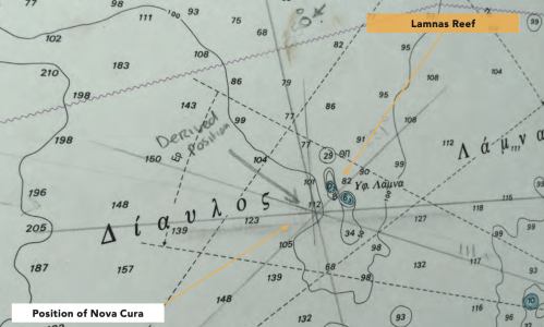
Edit: here's a similar situation on paper. First, a Greek paper chart:
1756391625472.png

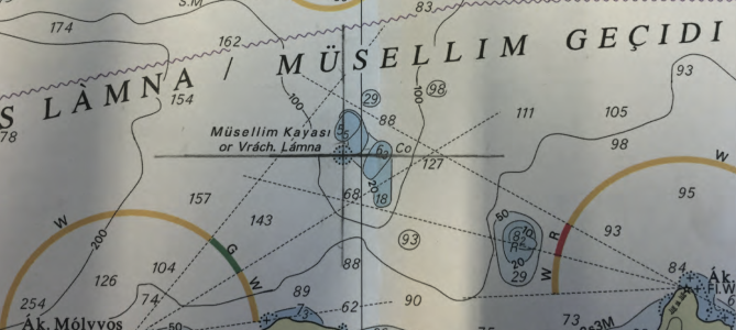
And second, the UK paper chart:
1756391671990.png
 
Last edited:
Is that really how it works? Do the electronic chart publishers employ cartographers who study in minute detail the way hazards are presented? I suspect that presentation of data at various levels of zoom is decided by algorithm. Perhaps AI will enable better decisions about which hazards to display at ALL levels of zoom. Maybe.
Your electronic chart publishers are likely mainly re-selling HO data, but at least at the HO there are actual cartographers in play, the same ones making the paper charts. At least some 3rd party publishers likely have people in-house to add supplemental data, but it would be financially advantageous to just automate the conversion process. I can see some trade-offs being made.

In brief, there are various factors in play: HO charts vs 3rd party, vector vs raster, paper vs electronic.

People often miss that first point, so let me draw an analogy. Suppose paper charts are very expensive, but you've got a few guys down the street who offer paper charts for cheaper. One of them has a high-quality copier, keeps an up-to-date portfolio, and uses local knowledge to hand-draw additional features. Another other keeps a less up-to-date copy, and their copier doesn't evenly apply toner, so some features may be faint or smudged. Others are somewhere in-between.

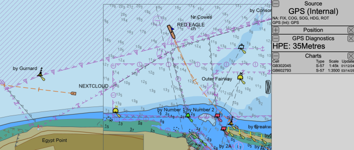
Here's another example: I have two charts displayed for this area, one at 1:45k scale, the other at 1:3.5k. I'm zoomed to about 1:8.9k. That's sufficient to trigger the software to display the more detailed 1:3.5k chart. A paper equivalent would be taking scissors and cutting & pasting more detailed paper charts over the overview chart.

There are really only two algorithms at play here: one that determines at which zoom level to start displaying the more detailed chart, and an optional decluttering filter. Each object has a SCAMIN value defined that means "stop showing me when zoomed out past X scale", set by the original cartographer based on the importance of the object. Toggling this feature enables de-cluttering based on that.
1756389571479.png
 
Vestas were using vector charts, not raster charts, C-Map MAX, to be exact. This makes very interesting reading: https://www.hydro-international.com...-of-the-volvo-ocean-race-stranding?output=pdf. Even the very small scale overview raster chart of that part of the Pacific clearly showed the Cardagos Carajos. The investigation report stated that had the navigator been using raster charts, or paper charts, the accident would not have happened.
This shows a lack of understanding of the issue at hand. The chart itself is irrelevant, it's just a source of information with various points, organised in layers. The chart contained all of the information required, and likely more than the raster chart would have available. It also has the massive advantage of a display being able to dynamically display the data, so avoids accessability issues like colour choices and font sizes.

The display device did not choose to display an item that was useful. That has literally nothing to do with the chart source. Until we start addressing the actual problem, these things will not improve. The manufacturer of the MFD/Plotter has some work to do on their chart display functions, but the chart source is fine and fit for purpose.
Well, we often differ, but on this I agree. Vector charts embed FAR more information, much more economically than a raster chart does. The underlying data (and cartographic decisions) are ALL made in the vector data; raster charts are merely a specialised output form. And as @lustyd says, it's all about decisions made by the USER of the system, and underlying decisions about the exposure of the appropriate level of control to the USER. And just for example, it's perfectly possible for a vector-based chart to be used to establish safety zones around hazards; this simply cannot be done using a raster chart. I think some modern plotters will do that - I haven't investigated it on mine. It's a fairly simple task for a vector-based system; it's impossible for a raster-based system.

I would argue that we do need a consistent and intuitive approach to the user interface of chart plotters, but that's a harder problem as it involves agreement between competing companies!
 
Last edited:
That's why I included the screenshot, which was from a small-scale ENC vector chart. Omitting the shoals was a chart error, no different from someone omitting it on paper. The accident similarly wouldn't have happened if they were using a UKHO vector chart.
I see what you were saying.

But what makes you think the UKHO vector chart would be any better? All vector charts have stores of data which are displayed according to the plotters algorithms.
 
Top