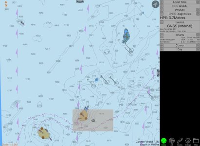
Open CPN, UK charts. Admiralty & alternatives

I would argue that we do need a consistent and intuitive approach to the user interface of chart plotters, but that's a harder problem as it involves agreement between competing companies
Thoroughly agree with this, and I think it’ll take a lot more people understanding what to ask for to make it happen.
We don’t necessarily need more control, but more sensible defaults other than show/don’t show are vital in my opinion. Even in shallow waters I don’t need to see every rock and obstruction and often new sailors will steer around something 50m down just because it’s on the chart. An advanced mode with more control would be nice, although I think I’d prefer that on an app on a laptop to the plotter.

Hopefully we’ll see movement in this area soon, as paper fades away more and more.
 
This shows a lack of understanding of the issue at hand. The chart itself is irrelevant, it's just a source of information with various points, organised in layers. The chart contained all of the information required, and likely more than the raster chart would have available. It also has the massive advantage of a display being able to dynamically display the data, so avoids accessability issues like colour choices and font sizes.

The display device did not choose to display an item that was useful. That has literally nothing to do with the chart source. Until we start addressing the actual problem, these things will not improve. The manufacturer of the MFD/Plotter has some work to do on their chart display functions, but the chart source is fine and fit for purpose.
You did not understand what I wrote.

Of course the vector chart contains a much larger store of data -- that's how vector charts work. Raster charts contain only that data selected for several specific scales. They are already processed. Vector charts contain all the raw data, and the processing is done by algorithm, in the ECDIS terminal or other display device.

It's the algorithm which chooses what to display at any given zoom level, when you're dealing with vector charts, vs. the human cartographer with raster charts.

The Vestas incident is the classic case of the algorithm failing to distinguish between important and unimportant data, and not showing the islet and shoals. If you read the MAIB report, it specifically says: "This would not have happened had the navigator been using paper charts, or raster charts."

That's not to say, that the algorithm couldn't be better designed. I'm sure it could be designed to show hazards in the middle of an ocean at whatever zoom level. I'm sure these techniques will be improved in the future. Vector charts are certainly here to stay.
 
It's the algorithm which chooses what to display at any given zoom level, when you're dealing with vector charts, vs. the human cartographer with raster charts
The algorithm chooses what to display period. The zoom level may or may not be part of that algorithm, nor is it relevant in all scenarios.
An algorithm and a human cartographer can work in identical ways.
 
But what makes you think the UKHO vector chart would be any better? All vector charts have stores of data which are displayed according to the plotters algorithms.

The role of the algorithm is overrated. Each vector chart contains more or less equivalent "data" to its raster counterpart. With S-57 ENCs* each "chart" is self-contained with the data appropriate for its intended scale, just like a paper chart. Assuming SCAMIN is disabled and display standard is set to "all", you should see everything.

The UKHO vector chart I pulled up has an intended scale of 1:3,500,000. Because you can zoom vector charts to arbitrary levels, people often think all the objects are piled into one single datastore, but it's much more a case of loading and unloading the appropriate scale charts on the fly. It wasn't a case of an algorithm deciding the shoal was unimportant, it was a case of the chart for that scale not containing the shoal at all, just as with the paper charts I posted in 116.

*I'm speaking to what's standard for "official" charts, 3rd party charts may vary, just as a chart printed on a restaurant placemat may or may not be an accurate copy of an official paper chart. Yes, it's a bit snobby, but we really must have some standards.

cargados.jpeg
 
but it's much more a case of loading and unloading the appropriate scale charts on the fly
A quite old way of thinking about it. While vector chart layers may have default zooms, but the dataset literally is just a database and can be used as such. It would be entirely possible to find all rocks shallower than 10m at a given state of tide and display them at every zoom level.

Arguably cartographers have become the problem rather than the solution at this point, and we’re better off setting aside the past and having a rethink about approach. We saw similar with maps 20 years ago where OS and peers were stuck in their rut and needed software folk to rethink.
Licensing is the other problem, and with is leaving the EU we may never see our data opened up.
 
The algorithm chooses what to display period. The zoom level may or may not be part of that algorithm, nor is it relevant in all scenarios.
An algorithm and a human cartographer can work in identical ways.
Could, theoretically, work in identical ways. And I'm sure as the technology advances, we shall see that more and more. AI will work wonders here.

But zoom level of course is the most directly relevant factor in how the algorithm chooses what to display. There is only so much screen real estate, so as you zoom out, data is necessarily stripped out. It's simple mathematics.
 
But zoom level of course is the most directly relevant factor in how the algorithm chooses what to display. There is only so much screen real estate, so as you zoom out, data is necessarily stripped out. It's simple mathematics.
None of this is true or even logical. While it’s true that more can fit in the field of view when zoomed in that has very little to do with the decision of what to display. It’s this kind of thinking that led to “display all the rocks at zoom level 5” type nonsense in the first place and has led to some incidents.
If, instead, we rank by danger then all objects deemed dangerous can be displayed at all zoom levels whether they are rocks, other vessels, or overfalls while interesting but safe stuff like deep wrecks or dolphin sightings may be left out at all zooms unless specifically enabled for interest.
We can also do clever stuff like leaving out church spires if the GPS accuracy meets a given threshold.

The point being, it’s not a paper chart and we don’t have to be rigid any more with scale and content nor do we need to decide ahead of time.

We can also take into account screen size and pixel density. A modern 12” high resolution screen can and should display more than a 20 year old 6” low resolution display.
 
A quite old way of thinking about it. While vector chart layers may have default zooms, but the dataset literally is just a database and can be used as such. It would be entirely possible to find all rocks shallower than 10m at a given state of tide and display them at every zoom level.

This is technically true and may even be similar to how some companies have designed their chart formats. HOs may also have a similar master database from which they map objects to the appropriate charts.

However, chart sales, licensing, and updates for ENCs are still managed on a chart-by-chart basis, as with paper. A reef on a small-scale ENC is a completely independent data entity from the corresponding reef on a large-scale ENC. (edit: so far as I'm aware, there is no UUID or similar identifier that could be used to relate them, and this would be more problematic if, say, using a small-scale UKHO chart with a large-scale SHOM chart.)
 
Last edited:
None of this is true or even logical. While it’s true that more can fit in the field of view when zoomed in that has very little to do with the decision of what to display. It’s this kind of thinking that led to “display all the rocks at zoom level 5” type nonsense in the first place and has led to some incidents.
If, instead, we rank by danger then all objects deemed dangerous can be displayed at all zoom levels whether they are rocks, other vessels, or overfalls while interesting but safe stuff like deep wrecks or dolphin sightings may be left out at all zooms unless specifically enabled for interest.
We can also do clever stuff like leaving out church spires if the GPS accuracy meets a given threshold.

The point being, it’s not a paper chart and we don’t have to be rigid any more with scale and content nor do we need to decide ahead of time.

We can also take into account screen size and pixel density. A modern 12” high resolution screen can and should display more than a 20 year old 6” low resolution display.
Precisely.
Vector charts are perfectly safe - at least insofar as anything can be within the limits of the available survey accuracy (though sadly few if any leisure chart displays let you see the CATZOC rating to know how trustworthy the survey data is).
All new paper charts - and the electronic raster charts from which they are printed on demand - are generated from the raw data which is held by the HO in vector format anyway.
Currently there are human cartographers who make design choices to help created the raster charts from these (who sometimes make mistakes, occasionally big ones - ask me how I know!). It is easy to see how AI can and will be used to do this in future, to reduce costs.
The issues frequently quoted about vector “charts” are actually not about the charts but the display software - and the choices the software designers made as to how these are displayed.

As lustyd says, with sensible design there should be no issue of dangerous shoals etc disappearing due to zoom. Instead, as lustyd says, if the hazard factors are defined and prioritised the sofware solution for shoals with rocks etc embedded is simple - when summarising an area for zooming out, take the most dangerous aspect within the area box being summarised. So for example, simply display the least depth or the highest drying height when zoomed.
This is what RIN and CA have referred to as “safe zoom” as a key requirement for a good electronic navigation system for pleasure craft. Let’s hope some of the suppliers will incorporate this.
 
This is technically true and may even be similar to how some companies have designed their chart formats. HOs may also have a similar master database from which they map objects to the appropriate charts.

However, chart sales, licensing, and updates for ENCs are still managed on a chart-by-chart basis, as with paper. A reef on a small-scale ENC is a completely independent data object from the corresponding reef on a large-scale ENC.
There are several reasons why charts (even electronic ones) are sheet based, and not a seamless database such as the OS uses.

  1. The vertical datum of chart data necessarily varies from place to place, unlike the fixed datum of the OS. This has many consequences, making harmonisation of data intractable.
  2. The density of information required varies enormously from place to place. OS data does vary in density, but only by a factor of two, which is tractable.
  3. There are international agreements regarding sheet boundaries that are used to exchange data; there is an agreed set of charts on a global basis with each HO taking responsibility for particular sets. HOs exchange data so that versions of the charts can be produced with (for example) notes for navigators in a different language. Such charts have INT preceding the chart number .
 
I would strongly suggest that people should stop seeking to use the Vestas Wind grounding as a reason that “vector charts are not safe”, as if examine in more detail, it is a very poor example. Certainly it should not be quoted unless have first read through the detail of the findings - https://keyassets.timeincuk.net/ins.../Volvo-Ocean-Race-Team-Vestas-Wind-Report.pdf

Like the arguably much more serious incident when multiple Clipper yachts ran aground or into danger on the South African coast, a huge factor was in fact not the navigation systems but the navigation processes - or lack thereof. In both cases the skippers and crews were focussed on racing tasks, and not giving sufficient time to checking the navigation - ie people and process issues. Easy to say with hindsight sitting ashore, but clearly easier to forget when in the heat of a race when other things go wrong (bad weather, problems gybing spinnakers etc) when the navigators get distracted as they are performing other roles as welll.

On the Clipper boats incredibly they had no plotter visible to the crew on deck, and nobody looking at the plotter below decks in an out of the way nav station, when all hands had leapt on deck to do boat handling / racing stuff. I would need to check, but I am not sure they had defined navigator roles / watches at the time either, one of the reasons for the demand for second qualified professional crew (now in place as a result of a number of different incidents).

On Vestas they had two dedicated computers running weather, routing and navigation software. BUT read paragraphs 61 and 62 of the report and consider carefully.
a) the software they were using, and which would control the zoom displays, was not the typical Navionics etc that most of us use but specialist software chosen for the racing needs - Adreana and Expedition software
b) one of the computers only had the default world map - ie they had only bought / installed the detailed CMAP chart licences for one of these two computers (and apparently may not have on other secondary devices either, it was implied).

Then read paragraph 148. This states that the skipper “checked the chart” by looking at the routing system running Adrena software that did not have the detailed chart data! So all this stuff talked about zoom details etc is pretty irrelevant when the “chart” being checked in the heat of the racing didn’t even have the detailed chart data installed. This was only on the other computer.

These comments are not intended as criticisms. The above is a massively summarised extract from the official report, and my apologies if I have mistakenly summarised wrongly. As noted at the start, please read the actual detailed report and use that not my extracts.
But it shows that most of the references to the Vestas Wind incident trying to argue that vector charts are bad and paper is good are not actually based upon informed fact. (And indeed, if you look at the survey date on the then current UKHO paper chart, as opposed to the very recent Indian HO electronic chart survey, that might also be informative - the UKHO chart was reportedly withdrawn shortly thereafter.)
Also I looked up the location of the stranding on Navionics web viewer (sadly now gone) and failed to find a way to create a zoom view that did not show the danger. I didn’t check CMAP, but perhaps somebody else will do so.

From the report this seems to have been a racing accident on a boat not set up with equipment or software most of us use, and on the computer referred to by the skipper at the time, apparently no detail charts actually installed.
There are hundreds if not thousands of cruising yacht groundings on rocks and shoals each year, which might offer better examples. These have a huge variety of reasons, many momentary distractions meaning the navigation is forgotten (as Clipper and Vestas), haven’t we all been there in the heat of the moment; many by source chart errors, whether rocks missed by the survey or omitted from the chart by accident by the cartographer; many by setting wrong waypoints etc.

So let’s park this Vestas non representative “example” one once and for all and move forward.
 
Last edited:
I would strongly suggest that people should stop seeking to use the Vestas Wind grounding as a reason that “vector charts are not safe”, as if examine in more detail, it is a very poor example. Certainly it should not be quoted unless have first read through the detail of the findings - https://keyassets.timeincuk.net/ins.../Volvo-Ocean-Race-Team-Vestas-Wind-Report.pdf

Like the arguably much more serious incident when multiple Clipper yachts ran aground or into danger on the South African coast, a huge factor was in fact not the navigation systems but the navigation processes - or lack thereof. In both cases the skippers and crews were focussed on racing tasks, and not giving sufficient time to checking the navigation - ie people and process issues. Easy to say with hindsight sitting ashore, but clearly easier to forget when in the heat of a race when other things go wrong (bad weather, problems gybing spinnakers etc) when the navigators get distracted as they are performing other roles as welll.

On the Clipper boats incredibly they had no plotter visible to the crew on deck, and nobody looking at the plotter below decks in an out of the way nav station, when all hands had leapt on deck to do boat handling / racing stuff. I would need to check, but I am not sure they had defined navigator roles / watches at the time either, one of the reasons for the demand for second qualified professional crew (now in place as a result of a number of different incidents). . .
With respect, I don't think anyone on here said "vector charts are not safe". I think everyone would agree with you that it's all a question of process. And as we know, navigation on commercial vessels is done predominantly with ENC vector charts (even if it's said that many masters prefer raster charts for their own use), so obviously vector charts can be perfectly safe if used correctly.

I think the most which anyone has said is that raster charts -- at the current state of the art -- make safe nav processes easier, particularly when using smaller scales. I like them (for nav, not for pilotage on a small screen) just because they are nice to work with, showing more relevant and less irrelevant data, at particular scales, giving a much better overview with less work. I'm sure AI and better controls will make the display of vector charts better and better, and perhaps raster charts will even disappear. We shall see.
 
Top