Open CPN, UK charts. Admiralty & alternatives

I'd actually regard that as dangerous. Recontouring the bathymetric data is fraught with potential for error, as frequently seen with Navionics crowd sourced data, where missing data is interpreted as licence to interpolate, rather than "no-one goes there so it isn't safe"!. The contours provided in UKHO data are based on far more data than is present on the chart, and are reliable and drawn so that any error will be on the safe side of indicating shallower water than it actually is. But recontouring on the basis of the selected soundings on the chart and the contours is not a safe or straightforward matter; there are many possible algorithms and they all give different answers! The only one where you get an estimate of the accuracy of the interpolation is Kriging, which is extremely computing intensive, even now with modern processors, as it has to examine all the data to create a semi-variogram.
I think crowd source data should be banned. It is difficult because it can add some very good information. But the trouble is the absence of metadata. Any comment in that context must have full metadata and even then I think that is risky when a user's understanding of navigation is based on an iphone.

I should have added to my previous that one manufacturer several years back did add a drying height in a channel but did not draw the contours for a month (it might be more but I need to go back to my records to check). So during that month if you missed that single drying height .........
 
Crowd source data is just another layer that you have to enable on your plotter. It would be insane to ban it altogether given the obvious potential there. Sweden have banned it very effectively and there are endless complaints from users there who don't get to take advantage of additional data.

If you don't like it, don't use it. Don't try to stop others taking advantage of it though, you're not the skipper of my vessel.
 
That's a presentation issue, not a chart issue. You or your plotter have a setting that decides the detail. The chart is a single set of data in layers, which can be turned on and off.

Yes, but then I quite like the Navionics crowd sourced data which is often much more useful than the standard data. In many places it produces a higher resolution view of a location. It can also be produced with a handheld echosounder on the fly in a dinghy before taking in the big boat.

No, the chart and the chart maker don't make those choices. A vector chart is just a data set consisting of points, lines and polygons with some metadata which can be interpreted by various systems. The plotter or software producer may make those choices, they may provide some defaults, and hopefully they provide an interface for you to change those choices. If not, change your plotter but it's not a chart issue.
Oh dear oh dear. Of course it isn't a chart issue. Let me spell it out to. Have you looked at how vector charts handle marginal notes? Take the example that a leisure vessel should not use a particular channel. If I have a raster chart I look at the marginal note. Easy. If I have a vector chart there is of course no margin. So the manufacturers of vectors will either completely ignore them (yes, some do) and others place the advisory note at the channel. But at 10nm zoom there is no warning. At 5nm zoom there is no warning, at 2nm zoom there is no warning, at 1nm zoom there is no warning, at 0.8nm zoom there is a 'Headline' -"Draught restrictions - use lower zooms". If you zoom in again to 0.4nm you will get the full advisory. So you basically have to get down to at least 0.8nm zoom to find it which is a bit tricky.

But the point is, it is the chart maker who decides what is displayed at the different zoom levels not the plotter.

Your comment about crowd sourced data is a bit odd. The 0.7 sounding was never from crown sourcing. A survey had been conducted and wisely the UKHO thought it necessary before another edition of the chart to issue a Notice. How would you reduce data to chart datum? If I had a depth say here and it said 1.5m. And if I added a community edit saying 'only 1.5m here', waht was the hieght of tide at the time?
 
I think crowd source data should be banned. It is difficult because it can add some very good information. But the trouble is the absence of metadata. Any comment in that context must have full metadata and even then I think that is risky when a user's understanding of navigation is based on an iphone.

I should have added to my previous that one manufacturer several years back did add a drying height in a channel but did not draw the contours for a month (it might be more but I need to go back to my records to check). So during that month if you missed that single drying height .........
I'd actually be more nuanced. Crowd funded data should only be allowed where there is a good density of contributions from several different contributors, with a small standard error. What should NOT be allowed is extrapolation beyond the bounds of the data, or the use of sparse data from a single contributor.

Crowd sourcing is potentially useful, but a) there has to be a crowd and b) the data have to be interpreted responsibly. Navionics don't apply either of these conditions, so you get dangerous results in places.
 
Of course it isn't a chart issue. Let me spell it out to
Please don't try to be condescending, especially when you clearly don't understand the subject. You keep insisting that these issues are vector chart based and I keep correcting you. No, you can't spell it out to me as you don't even understand the subject.
But the point is, it is the chart maker who decides what is displayed at the different zoom levels not the plotter.
No, it really isn't. Nothing you say will change that. The chart maker of vector charts literally just collates the information into a standard format. It's up to the presentation layer (aka plotter/software) to decide what to show, when, and where. If you're not willing to accept this simple fact of the technology then you're never going to understand it or have a valid opinion on how it is or should be used. There is absolutely nothing in the technology to prevent that note being displayed in 72 point font at every zoom level, and on many systems the user could choose to do so. The reason it's often not displayed at wide zooms is because it clutters a page which is best used for passage planning. If you want to do pilotage on large scale charts then you'll probably need to change a few presets. The rest of us use a sensible zoom when doing pilotage, or we write pilotage notes beforehand, or better mark a course on the plotter to follow.
 
Some of them do compensate for tides these days. Whether you trust it is a personal choice, but the technology is certainly there and available and I think it's foolish to dismiss it as we've seen with various other advancements over the years. There's no reason not to use auto routing for the initial broad brush and then tweak from there. There's also no reason you can't auto-route to sanity check a manually created route.
Which "of them" compensate for tides these days ? How does that work ?

I'll stick to be foolish and do my own passage planning, where i can plan it knowing when i'll be leaving, how fast i'll be travelling and what the state of tide will be.

Seems like good seamanship to me.
 
I'll stick to be foolish and do my own passage planning
I didn't say doing your own planning was foolish, it's certainly not. I said it would be foolish to dismiss a new technology with enormous potential. We've spent decades convincing people that electronic navigation works and rather than trying, testing, adopting, we've seen needless pushback and now a sudden shock with the withdrawal of paper charting by those who remain unprepared.
Electronic planning is in its early days, but it is getting better and has proven itself in many other areas. The important thing is to know the current limitations and to update skills to ensure you're getting the most out of what's available. It's entirely likely that electronic planning would have spotted lots of issues that humans have missed.
 
Regarding Font Size

If you're talking 3rd party vector charts then all bets are off. For example, Navionics seems to assume people love reading very tiny fonts. (I like small fonts, but their sizing is miniscule even for me.) On what I'll call "professional" applications, the type approved for commercial use, then there are standards around how large the letters must appear on screen to ensure effective visibility. (And on other apps you may be able to change the sizes, a feature that IIRC Navionics does include.)

Regarding Zoom Levels
The chart maker of vector charts literally just collates the information into a standard format. It's up to the presentation layer (aka plotter/software) to decide what to show, when, and where.
This is... technically true. But, each ENC chart has its own set of data. I think most people here are used to buying bundles of charts like Navionics offers, where all available zoom levels are included. If you're using official ENCs, they are available in the same fashion as paper charts: you can pick the zoom levels and coverage most appropriate for your use, and if it's an ENC with a smaller compilation scale, some details will often be omitted compared to a more detailed chart.

I think it's can't rather than won't. Many harbour plans added on small craft charts or commercial packages like Navionics come from harbour authorities or marina operators. Really useful stuff for yachties. But the international standard, and the new UK Small Craft spec. doesn't allow this data to be on a chart - government agencies only.
Ah, mentioning the Solent may have been a distraction; I'm not referring to data excluded for that reason. Rather, assume both the 1:200k and the 1:20k ENC charts are both official government charts.
 
you can pick the zoom levels and coverage most appropriate for your use, and if it's an ENC with a smaller compilation scale, some details will often be omitted compared to a more detailed chart.
Strictly speaking though, what you're describing is a package, not a function of zoom level. I agree that different packages include different information. Ordnance Survey sell their map data by the layer, and it would be crazy to expect layers you didn't buy to show up. The layers you do have though can appear at any zoom level because this is a software feature.
 
Regarding tides, that can be done using the safety depth settings. (This too is a commercial ECDIS concept that often appears in recreational apps.). I'm not too fond of auto-adjustment, as often the tidal height at the present moment tends not to be the height by the time I arrive, and length of stay can vary.

A general convention is to set the safety depth/contour to a comfortable level (i.e. your draft + suitable safety margins); that provides a nice bold contour line, bolds shoaler soundings, and adjusts the water color to provide a clear visual indication of "safe" water. This can be updated to account for tide.
Strictly speaking though, what you're describing is a package, not a function of zoom level. I agree that different packages include different information. Ordnance Survey sell their map data by the layer, and it would be crazy to expect layers you didn't buy to show up. The layers you do have though can appear at any zoom level because this is a software feature.

If using a 4-colour setting, then the "shallow" contour (if available) is commonly set to the "you will run aground" depth and the "deep" contour can be used for whatever you like, e.g. "too deep to anchor" or something else.
 
Regarding Font Size

If you're talking 3rd party vector charts then all bets are off. For example, Navionics seems to assume people love reading very tiny fonts. (I like small fonts, but their sizing is miniscule even for me.) On what I'll call "professional" applications, the type approved for commercial use, then there are standards around how large the letters must appear on screen to ensure effective visibility. (And on other apps you may be able to change the sizes, a feature that IIRC Navionics does include.)

mmmmmmm I have to take issue here ......

To compare a Yotties display of Navionics and a Commercial Ships display of Vector charts are way out of league .... of course its hard to read a Navionics font on a 10" ... 12" plotter etc .... but a commercial display of Charts etc is not a piddly little 12" display !!
 
Strictly speaking though, what you're describing is a package, not a function of zoom level. I agree that different packages include different information. Ordnance Survey sell their map data by the layer, and it would be crazy to expect layers you didn't buy to show up. The layers you do have though can appear at any zoom level because this is a software feature.
For the layers that are included, yes, that's indeed a software feature. On nautical apps the "disable SCAMIN" setting enables all features to be shown regardless of zoom level. (For those unfamiliar, "Scale Minimum" is an attribute added to objects that might overly clutter the chart when zoomed out, e.g. if you have a row of buoys you might prefer only the two on the ends to show at 1:200k, and the others to show up at a zoom level below 1:140k, so those others might have SCAMIN set to 1:39999.)

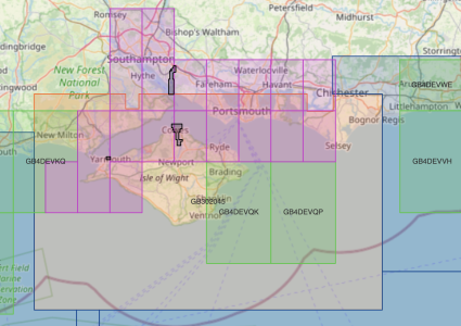
Below is an example of UKHO ENC charts available for one area. If I purchase only the orange chart, there will be details on the purple or green charts I don't have, just like paper.
1738856809487.png
 
Navionics charts can be viewed on a variety of devices including Raymarine, B&G/Navico, later Garmin, PC Software, and phone apps. All of these will display the font of their choosing which has nothing to do with the vector chart data.
 
Navionics charts can be viewed on a variety of devices including Raymarine, B&G/Navico, later Garmin, PC Software, and phone apps. All of these will display the font of their choosing which has nothing to do with the vector chart data.

If that's aimed at my post #91 .... my point was that display screen size makes a big difference and negates 'requiems' font size comment.
 
If that's aimed at my post #91 .... my point was that display screen size makes a big difference and negates 'requiems' font size comment.
While I agree about display size, the font size is a software feature, so many platforms will allow this to be changed if you need it larger for a bigger screen
 
mmmmmmm I have to take issue here ......

To compare a Yotties display of Navionics and a Commercial Ships display of Vector charts are way out of league .... of course its hard to read a Navionics font on a 10" ... 12" plotter etc .... but a commercial display of Charts etc is not a piddly little 12" display !!

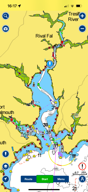
Ok, I should clarify, I was thinking of Navionics on my phone. There, Navionics' default text height is (pulls out ruler to check) literally 1mm! On my other phone app it's 2mm, and that app on my laptop display has 3.5mm tall fonts.

(digs around, here's something...) IEC 60945 specifies that character size in mm be not less than 3.5 x the viewing distance in metres. Hence "readable from 1 metre" requires that characters be not less than 3.5 mm in size.

I think this is reasonable regardless of whether yottie's plotter or commercial display. (And it's been a little while, but IIRC Navionics as displayed on a plotter is more reasonable.)
 
For the layers that are included, yes, that's indeed a software feature. On nautical apps the "disable SCAMIN" setting enables all features to be shown regardless of zoom level. (For those unfamiliar, "Scale Minimum" is an attribute added to objects that might overly clutter the chart when zoomed out, e.g. if you have a row of buoys you might prefer only the two on the ends to show at 1:200k, and the others to show up at a zoom level below 1:140k, so those others might have SCAMIN set to 1:39999.)

Below is an example of UKHO ENC charts available for one area. If I purchase only the orange chart, there will be details on the purple or green charts I don't have, just like paper.
View attachment 189175
Go on, tell us how much it would cost per annum to buy all these Solent charts shown there (not just the 1:200k planning chart, which doesn’t have enough detail)
 
Ok, I should clarify, I was thinking of Navionics on my phone. There, Navionics' default text height is (pulls out ruler to check) literally 1mm! On my other phone app it's 2mm, and that app on my laptop display has 3.5mm tall fonts.

(digs around, here's something...) IEC 60945 specifies that character size in mm be not less than 3.5 x the viewing distance in metres. Hence "readable from 1 metre" requires that characters be not less than 3.5 mm in size.

I think this is reasonable regardless of whether yottie's plotter or commercial display. (And it's been a little while, but IIRC Navionics as displayed on a plotter is more reasonable.)

Imagine 3.5mm fonts on Navionics on a phone !!

Think that says it all ....
 
Top