You are using an out of date browser. It may not display this or other websites correctly.
You should upgrade or use an alternative browser.
You should upgrade or use an alternative browser.
Just pictures
- Thread starter Kukri
- Start date
Kukri
Well-Known Member
Slowboat35
Well-Known Member
Slowboat35
Well-Known Member
Slowboat35
Well-Known Member
Kukri
Well-Known Member
Not the best of pictures but a picture of the best of yachts. Maidie, the Big Banana, the most exquisite boat I've ever seen - showing everything she's got.
View attachment 92571
That jackyard topsail really is “setting like a card”.
Slowboat35
Well-Known Member
You should see that boat go with a bit of wind! She only has a few inches of freeboard, carbon spars, dyneema to the shoelaces, kevlar sails and I think I'm right in saying 100 year old hull! Uniformed crew of youngsters as sharp as razors and they race her like a demon. afaik she can't reef - she carries what she starts with
Broads racing is an extraordinary spectacle, fast and competitive as hell - around the cans like a dinghy course but with 20+ big powerful boats all jammed up together in a small piece of water - some of them 50ft monsters like Maidie! The boats may be old but it isn't for the faint-hearted!
Broads racing is an extraordinary spectacle, fast and competitive as hell - around the cans like a dinghy course but with 20+ big powerful boats all jammed up together in a small piece of water - some of them 50ft monsters like Maidie! The boats may be old but it isn't for the faint-hearted!
Slowboat35
Well-Known Member
MikeBz
Well-Known Member
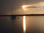
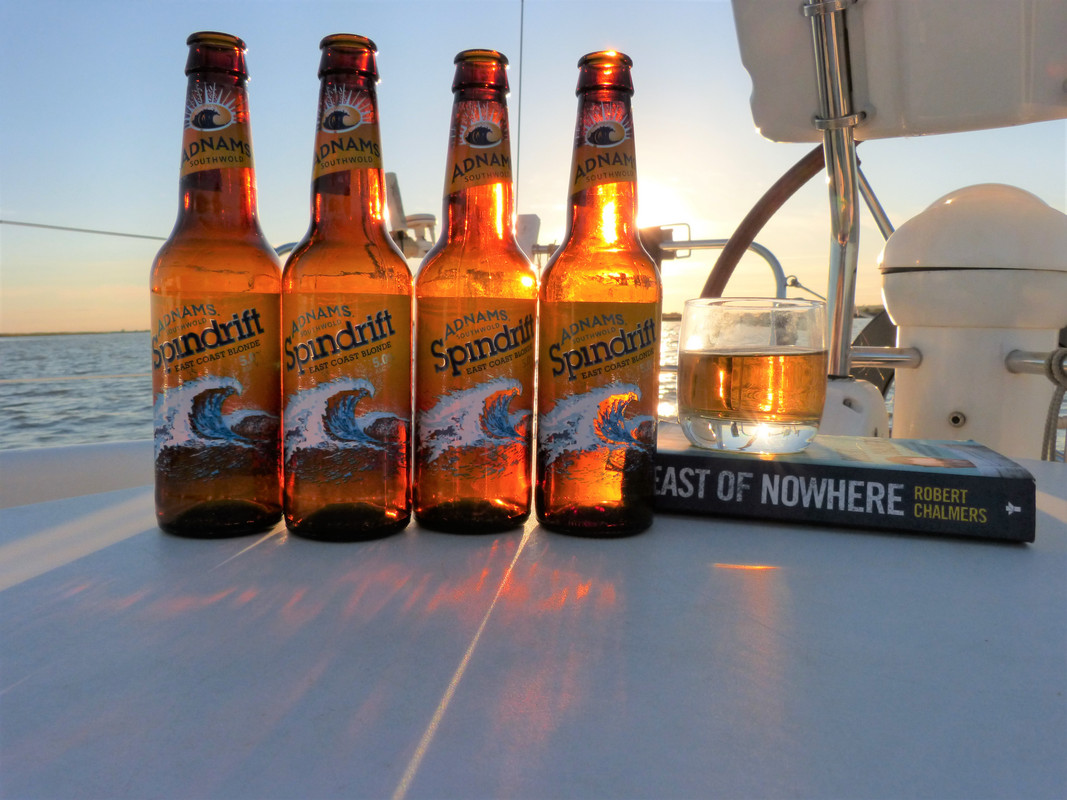
Continuing my theme, this time in the Pyefleet on 9 August 2015:

alandalus11
Well-Known Member
Tomahawk
Well-Known Member
Ok.. same image just a bit cropped and straightened.


Tomahawk
Well-Known Member
Or this?
I have cropped the majority of the left and top to focus the image on the ripples on the water leading from lower left to the line of boats leading towards the upper right.

I have cropped the majority of the left and top to focus the image on the ripples on the water leading from lower left to the line of boats leading towards the upper right.

Tomahawk
Well-Known Member
A pair of scissors has always been the photographers best friend to improve an image.
Of the two croppings, I think I prefer the lower one.
But there in no "right way".
Of the two croppings, I think I prefer the lower one.
But there in no "right way".
Koeketiene
Well-Known Member
Habebty
Well-Known Member
Black Sheep
Well-Known Member
I agree with you that playing around with cropping an image can often improve it. And I can see why you've attempted the two crops you've provided - trying to follow the "rule of thirds" with the horizon; trying to create a visual lead-in.A pair of scissors has always been the photographers best friend to improve an image.
Of the two croppings, I think I prefer the lower one.
But there in no "right way".
But, in my very personal opinion, you've taken a stunning picture that took my breath away with its beauty, and converted it to a couple of very attractive, but rather ordinary images.
I'm trying to analyse why, and it's not easy. Partly the 2/3 : 1/3 look is rather formulaic. But I think part of the beauty of the original is the symmetry between sky and water. Not the exact symmetry of a sunset on smooth water, but the impressionist echoes that come from what looks like a grey dawn breaking over ruffled water. With your two edits, you're deliberately focussing on either sky or water. With the original, they are given equal weight; that equality and equivalence between sea and sky is part of the beauty of the East coast. And something that has been lost in the cropping.
I'm sure others may think differently.
Black Diamond
Well-Known Member
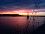
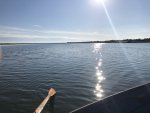
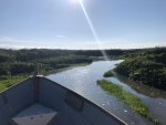
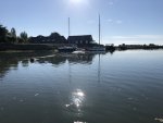
The top two were taken at 7am yesterday morning, in Strood Channel and then up the little creek by the Strood that usually is infested with jet skis and reeks of aftershave. The third was taken 8am Saturday morning, at the top of Peldon Creek with the smack Peace in the centre, pride of the recently late and highly respected John Milgate.
Attachments
Tomahawk
Well-Known Member
If this were the Lounge there would now be full on war. Someone would wade in with a diatribe about how to properly compose a picture.. But East Coast folks are of a kinder disposition.
pvb
Well-Known Member
alandalus11
Well-Known Member
Other threads that may be of interest
- Replies
- 3
- Views
- 229
- Replies
- 0
- Views
- 937

