Zing
Well-Known Member
Life expectancy charts are not the correct source material to understand life expectancy for adults in middle age. They are too skewed by infant mortality. You need to look at actuarial life tables, which show an improvement as we would expect, due to improved healthcare, reduced smoking, antibiotics and vaccines, but the improvement is not big.You would expect servicemen not to be fat. If they were allowed to become fat they wouldn't be much use at their job.
Regarding life expectancy, this shows how it has changed since the late 18th century.
United Kingdom: life expectancy 1765-2020 | Statista
See here:

https://www.actuaries.org.uk/documents/changing-shape-english-life-tables
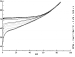
The 12 curves on the chart show life mortality rates on the Y axis for the age shown on the X axis. It shows the improving mortality from 1841 top curve, the 8th = 1911 to the bottom one = 1971. So in 1841 the mortality rate for a new born was 70, which decreased to 40 in 1971. That's where most of the improvement in life expectancy has come from. Once you get to late middle age, the improvement since WW1 has not been huge, especially for the elderly.
Also, the obesity problem has, contrary to your expectations in fact got into the armed forces. In the US military they have a 17.4% obesity rate:
Obesity rate rising in U.S. military; Navy is fattest branch: Report
Last edited:

