Are navionics the best charts?

Exactly - presumably the Martian canal at St Vaast was the result of one boat sneaking over the oyster-beds at high water, with no correction made for the tide.

I could never see it being sensible to leave such corrections to the end users, so I assumed they took raw depths along with timestamps and applied a tidal hindcast back at Navionics HQ (obviously can't help with the air pressure). I wonder whether this assumption was wrong, whether the correction process somehow screwed up, or if the data was just completely bad due to a miscalibrated transducer offset or something?

I don't think my plotter can display the user-supplied layers anyway, but if it did I would certainly leave them turned off most of the time. Might take a quick peek (with associated handful of salt) where survey data is lacking.

Mostly I still like to use a paper chart on the table for overview and where the plotter picture is unclear.

Pete
My plotter can't either, but it wouldn't if it could!
You highlight another problem with user supplied data and that is, what vertical offset is being applied to the data, and how accurately is it set? People set the depth sounder to at least three possible offsets; depth below water level; depth below keel and depth below transducer. As far as I know, it is only the depth with offset that is available for recording via the NMEA/Seatalk bus. And of course, the offset need not have been set correctly; I have reason to know that as I found that mine was 40cm off by hitting a sandbank outside Lowestoft sooner than I expected!
 
Do you not have a lead line aboard? The only thing that gives the actual depth of the wet stuff 100% of the time.
 
People set the depth sounder to at least three possible offsets; depth below water level; depth below keel and depth below transducer.

At least - there's also "depth below keel, plus a bit for safety", "depth below keel plus a lot, because we don't want our charter customers taking chances", and "depth below the keel of the boat this second-hand sounder was previously fitted to" :p

EDIT: Also "random offset put in by mistake while trying to set the depth alarm without reading the manual" :)

Pete
 
Last edited:
Be very, very careful with Navionics "brilliant contours": they come either from user-contributed data (and they have no idea about tides, I have lot of examples if you wish), or very often they are "computed" contours: starting from the basic HO data, they rebuilt a mathematical surface of the bottom, then "slice" it with horizontal planes ad libitum to increase the number of contours, which of course appear nice but have no navigational meaning.
If you are used to have data from an HO and used to its limitations, mixing/adding other type of data which is not built to the same standard is plain wrong, if not dangerous.
Ok criticism on conceptual grounds :D

According to an article in the June issue of YM, the raw data is uploaded to a Navionics website where they are collated and adjusted for tides before the enhanced charts are released for use.
 
According to an article in the June issue of YM, the raw data is uploaded to a Navionics website where they are collated and adjusted for tides before the enhanced charts are released for use.

And also from that article, the summary of their results was
* raw chart without user data was pretty much accurate
* overlay the user gathered data the chart was very different - losing one channel altogether
* do a detailed survey, with careful calibration and a number of experts on board, eventually the chart got pretty much back to the original before messing about with
Hence using the user data screwed up a perfectly reasonable chart
 
Always one and often 3 of the devices on my boat are displaying raster images of UKHO charts - i.e. they are exactly the same (though often more up-to-date) than the paper versions I carry.

The provenance of the chart should affect the confidence you have it. The medium of display is another matter.

Went through Easdale sound last week with 10 cm of water under the keel. Antares chart spot on all the way. (Before you jump down my throat for risky seamanship, the conditions and tide were such that touching the bottom would have been no problem.)
 
i use the maxsea ipad app (am I the only one?) which came out best of the raster chart apps in a pbo or ym test . doesn't seem to give updates more than annually. zoom in, waypoint, chart swopping all bloody good. I like a "proper" chart and not one of these vector things where I can't see what light it is unless i click on it. the raster charts also seem a bit better about marking some of the hazards. south coast me, so hardly off the beaten track. vpleased with it except the annual update so I don't have the cowes breakwater yet (until renewal of subscription I hope).. used navionics last year, no issues except the vector thing,
 
For a while I have been using MX Mariner on an Android tablet, which gives Admiralty raster charts. I find it excellent for navigation, as I rather like raster charts on the strength that they don't hide hazards even if you zoom quite significantly. It is also reasonably priced, as I recall—I think charts for the Channel were something like £13. The interface could be smoother, but one gets to like it.
 
According to an article in the June issue of YM, the raw data is uploaded to a Navionics website where they are collated and adjusted for tides before the enhanced charts are released for use.

Hello Spirit of Glenans,
I do not know what their server does, according to the resulting charts it might still need some serious tuning

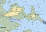
Example: this is the then Navionics chart (it has recently been corrected) of precisely two islands on Glenan archipelago, they are not secluded in summer they are full of people everywhere the anchorage is very popular. The chart (supposedly with datum at LAT) shows water between them

glen2.JPG


the following one is the original SHOM chart, the two islands are well separated at chart datum, actually during most tidal cycles there is a time interval when one can walk between them

glenshom.JPG

Ok this has been corrected, there are countless other examples anyway.

Navionics has no technical means to increase the details provided by the official charts, they simply mix them with their interpolations, user data to a variable extent to provide a product which is appealing at first sight (oh the nice contours), but which is a mixture of data with very very different errors/confidence intervals at least, very serious errors a worrying number of times.
:(
 
Not forgetting that depth's (and heights) can change very quickly in some areas. A good storm can move a shingle bank overnight.

Yes; and this can be true even in rocky areas! Many moons ago, in my father's boat, we entered Stonehaven on the East coast of Scotland. As we carefully followed the leading marks, we touched the bottom. On checking with the harbourmaster, it turned out there had been a landslip a few years ago!
 
Nope Admiralty, nothing else stands up as well to spilt beer or coffee. a few of mine have even gotten a bit mouldy in a few places. still going great. These print on demand ones are just no the same.:)
 
Navionics on iPad and iPhone is, imo, about as good as it gets. The gps positions are fine, generally speaking the charts are accurate and you can fiddle easily with the level of detail shown, especially the contour lines (which, as others have said, are largely extrapolations rather than actual depths). I've used the apps in the Med and UK and they're my weapon of choice for route planning and occasional close navigation in the final stages of approaches to unfamiliar locations as the monochrome chart plotter at the helm has a clunky zoom which often obliterates details when the selected level of zoom isn't in the original chart.
That said, bear in mind that all chart plotters are only as good as the original data much of which was obtained using lead lines and sextants in the nineteenth century........ And some bits of charts are still using a datum other than WGS84: a classic example is the approach to Messilonghi, where at certain levels of zoom the plotter reckons you're sailing along the road, whereas changing the zoom level brings you back into the middle of the channel.

I have navionics on the Tablet but also the Raymarine plotter. An advantage of the tablet is that the charts are more up to date, especially if you include community edits. I recently sailed into Bisceglie on the east coast of Italy. I was quite confused with the approach when looking at the plotter. Its charts had not been updated for a year. However the tablet with recently upload charts clearly showed the outline of the new breakwater - which had been added to the chart as a community edit. Ah ha! Now all was clear. The breakwaters are clearly visible on Google maps.

Having said all this, Navionics has not yet caught up with the changes at the Lefkas canal as our track overland shows....
. Interestingly, Google maps satellite view is up to date. . Wish I had seen this before approaching from the north, as I would have understood the meaning of the 3 yellow buoys

TudorSailor
 
Last edited:
This thread’s a few years old now, is Navionics a good iPad app to supplement an ageing inbuilt plotter?
 
As someone has pointed out, the charts are only as good as the survey information which they are based on and the only people who actually survey and that is the ukho. Having said that, I think that navionics may add some customer derived information into the mix but I think you can choose not to see that (and I advise you to do so as it has no quality control whatsoever).
It's been suggested that VMH and Antares do their own surveys but think this unlikely.
The difference in charts is therefore only in the presentation and as such a matter of personal preference. I'm happy with Navionics presentation as it's very similar to my Imray paper ones.
Personally I see no point in adding extra derived contours and find the display with them on confusing.
I've been using Navionics charts for years and see no reason to change. When they first started they were bought outright with free updates but now are on an annual subscription basis (like Microsoft office). Obviously advantageous to Navionics but not us.
 
.
It's been suggested that VMH and Antares do their own surveys but think this unlikely.
The difference in charts is therefore only in the presentation and as such a matter of personal preference.

You have gone a bit off piste from the OP’s topic about Navionics, but your comment about Antares is wrong. Antares Charts are all new surveys done by them (look on the website for details) - often of places never surveyed by UKHO, or not surveyed since the days of rowing boats.
But Antares only does detailed charts of Scottish anchorages, so not a Navionics alternative option.
 
I know nothing about navigation but have decided it is time to make a start in understanding it. I've read through the comments above and decided I'll use Admiralty Charts and I am about to buy a lap-top with Windows7 Pro. I'll download OpenCPN and buy some charts to try to familiarize myself with the gear.
Up till now I thought I'd have to buy a whole lot of C Maps (but they only get a brief mention above). Is that assumption wrong?
 
It appears that Antares do their own surveys but only for limited areas and their disclaimers don't exactly inspire confidence.
"All our charts have been compiled from our own surveys. Surveying is an art and not a precise science. None of those involved in the surveys have relevant qualifications and no warranty is offered as to accuracy or completeness. To enable you to decide whether you wish to use the charts we have set out the general approach taken, although do not guarantee that it was followed precisely in every case."
 
Last edited:
Top