Aquamaps as alternative to Navionics?

stu9000

Well-Known Member
Joined
8 Mar 2008
Messages
928
Location
near kingston upon thames, surrey
Visit site
Hi all,
I am doing my summer passage planning and have realised how unwieldy Navionics has become now the chart viewer does not show routes.
Only two Android devices can run the same user account. The tablet, the phone and the on board screen makes three. I read that if you sign in and out of devices several times you can be locked out.
A big blow was when Garmin pulled the chart viewer. Losing the ability to view and edit routes on the bigger screen was a big blow.
I emailed Customer Services, and even the CEO and CTO, but no response. So, I am pretty much done with the degraded offer from Navionics and am researching alternatives.

My criteria are:
  • good maps
  • easy manual routing (I have no interest in auto routing).
  • tidal and current data
  • able to overlay AIS data via wifi
  • works well on Android
  • browser accessible chart viewer with routes

Open CPN might be an option longer term as I do play with Pi kit and have got the Visit My Harbour maps working on a laptop with GPS a number of years ago.
But that will take time and I need something now to plan for a July jump off.

I think I will give Aquamaps a go, unless the advice here is to go a different route..?

Thanks as always.

S
 
I have used Savvy Navy, and while it was okay, it did have significant navigational issues. It does not show some man made hazards to navigation such as fish farms, boundaries or symbols, and overhead power cables. Apparently layers of data are purchased from agencies and this data is not included in what Savvy Navvy buy. I compared with Navionics and they include the data. So be careful with what you buy as it may increase risk.

I also subscribed to Angel Nav (UKHO raster charts) but have cancelled that subscription as the program is awkward to use with the worst help manual I have experienced. Offline planning was almost impossible, and chart scrolling and selection a waste of time as it doesn't scroll and select the next logical chart. It was as if the programme had been deliberately designed to have a difficult user experience. It did offer the ability to navigate traditionally and plot on screen fixes, CTS. I suspect that they focussed on that instead of user friendliness.

I use MemoryMaps with UKHO raster charts and that works fine inanition to my plotter charts. I would recommend Memory Maps and the UKHO raster charts, it does what it says on the tin at a very affordable price. No experience of open CPN. Also use Navionics and find that acceptable but I only use an iPad and phone.

I have no experience of Aquamaps but looking at their chart viewer for where I sail, I can see the fish farm boundaries and overhead cables that are missing on Savy Navy. Also their depth data appears to be the same as UKHO based on comparisons with other chart providers who supply independent depth data (limited areas). It looks interesting, I may subscribe and try it as my back up.
 
Angel Nav It was as if the programme had been deliberately designed to have a difficult user experience.
I would say it was!

They took the paper based process of navigation and turned it into software, rather than looking at the objective of navigation and working out the easiest user interface / workflow for a digital product.

Their desired features (three point fixes, EP etc in our increasingly GPS vulnerable world; CTS which nobody seems to do well digitally) might be valid but are not important enough to compromise the rest of the user experience.
 
Thanks for the responses.
My sailing ground is the East Coast with occasional hops to France and Holland.

In July, I want to go from Harwich to Ijmuiden. Depending on the weather I might then go north to the islands or take the mast up inland route to Amsterdam. I did Sheveningan in 2019 and I am hopeful all will go reasonably to plan, but there are a number of new wind farms to consider.

I have previously been an advocate for Navionics. Using the tidal current data on one device while tracking time to waypoints on another screen is my planning method. But the Navionics chart viewer no longer shows routes. I was considering getting another tablet (perhaps the Lenovo P12), but i am concerned that I might get locked out jumping between the two tablets and the on board Android display (Navionics permit only two device sign ins now).

The cost of Navionics is going up. They no longer respond to e mails. They are paring back the offer, probably to push a new more expensive offer geared to higher end plotters rather than cheap Android kit.
I have a Raymarine plotter at the helm but I find the Android solution much much more user friendly, not to mention an order of magnitude cheaper.

I was hanging on in there, trying to work with Navionics, but I doubt I will renew my £40 sub next year.

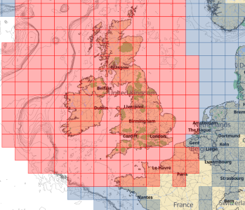
The Aquamaps map costs are £20 for the UK map set, which includes the French coast, but not Belgium or Holland.
That would be another £20.

2025-06-18 12_51_27-Chart viewer • Aqua Map.png
Aqua Map

I think I can get at least the UK map set on a 14 day trial so that is the next step.


Thanks
S
 
The enshittification of Navionics continues. I’m a fan of Garmin plotters but they shouldn’t be forgiven for what they’ve done to this app.
On my subscription-expired version, there is a nice ‘speech bubble’ at top of screen asking if you would like charts for this area? If you click on the ‘x’ it vanishes for a second, then reappears. Would be less of a problem on a tablet, but on my phone screen the speech bubble takes up about a fifth of the screen. Ahhhhhh!!!

I’ve read a few positive reviews of Orca lately, though I think to get the most out of it you need their ‘hub’ (piece of hardware).
 
I invested in a Visit My Harbour Tablet when Imray went all strange on us and withdrew and then did a U turn. Not particularly impressed with it, but I am a 'trad navigator, as I find the ability to passage plan on it rather limited.

I have an ancient Garmin Chart Plotter and use HomePort and BaseCamp for charts and maps. Works extremely well and allows me to do stuff on a PC then copy down to a card and upload it on the boat. But this is on a older Garmin chart not on, in my opinion, truly awful Navionics charts.
 
Aqua Map is my default recommendation for the average person who needs a decent charting app. Most navigation apps will simply re-sell official ENC data, and thus for the UK should match the UKHO ENCs.

I suspect Navionics, due to its age, has quite a collection of legacy chart data (e.g. built from scanned charts from ages past) that it incorporates, as well as occasionally using private survey data. This makes it useful when you want a "second opinion". The downside, particularly in remote areas, is you have no idea if the data is semi-recent or based on an 18th century chart. I can't really comment on Savvy Navvy, but I do have a distrust of apps that are intended to provide a dumbed-down user experience.

They took the paper based process of navigation and turned it into software, rather than looking at the objective of navigation and working out the easiest user interface / workflow for a digital product.

Their desired features (three point fixes, EP etc in our increasingly GPS vulnerable world; CTS which nobody seems to do well digitally) might be valid but are not important enough to compromise the rest of the user experience.
The sad thing is, these aren't features that are particularly hard to implement. (The ability to plot more than one LOP gets you there.) I suspect as soon as there's standardisation on small-vessel electronic navigation you'll see better-thought-out implementations.
 
... The sad thing is, these aren't features that are particularly hard to implement. (The ability to plot more than one LOP gets you there.) I suspect as soon as there's standardisation on small-vessel electronic navigation you'll see better-thought-out implementations.

It isn't the plotting feature, plotting LOPs was fine (but took a while to work out how to), it is how the App manages chart display and selection, scrolling and zooming that is difficult.
 
I invested in a Visit My Harbour Tablet when Imray went all strange on us and withdrew and then did a U turn. Not particularly impressed with it, but I am a 'trad navigator, as I find the ability to passage plan on it rather limited.

I have an ancient Garmin Chart Plotter and use HomePort and BaseCamp for charts and maps. Works extremely well and allows me to do stuff on a PC then copy down to a card and upload it on the boat. But this is on a older Garmin chart not on, in my opinion, truly awful Navionics charts.
 
It isn't the plotting feature, plotting LOPs was fine (but took a while to work out how to), it is how the App manages chart display and selection, scrolling and zooming that is difficult.

Agree. Part of the problem is you have people who understand UI/UX principles and modern app design, and then you have people who understand navigation, and unfortunately the Venn diagram of the two groups is quite small.
 
Agree. Part of the problem is you have people who understand UI/UX principles and modern app design, and then you have people who understand navigation, and unfortunately the Venn diagram of the two groups is quite small.
I'm carrying out the rewrite of AngelNav for Android - all these observations are being noted (good feedback, thank you, people). I agree that the UI is currently non-standard and needs adjusting. Interesting feedback on chart selection, zoom and pan.
 
I will come in to vote strongly in favour of OpenCpn (the paid for version!) on android. But think it was £7 or so a few years ago.

Coupled with ocharts & Antares - a little button on screen to switch between chart data sets. Clear and intuitive to use - It has tidal height data but I don’t think it has current data, but might not have added the correct “plugin” for uk tides. Seems to integrate with ais well.

I’ve got one version on my old android mobile which is super reliable and a bigger set up on a raspberry pi linked to a 15” monitor below
 
I'm carrying out the rewrite of AngelNav for Android - all these observations are being noted (good feedback, thank you, people). I agree that the UI is currently non-standard and needs adjusting. Interesting feedback on chart selection, zoom and pan.
Well, since you stuck your neck out...
  • I find plotting all the traditional fixes* can be easily done with LOPs, so long as:
    • You can independently reposition either endpoint (changing bearing and length) via end handles.
    • You can reposition the entire line (preserving bearing and length) via dragging from anywhere else.
  • Chart stitching and automatic transition to the next appropriate scale is really important for for UX.
    • This doesn't preclude the option to "hold" a particular scale to allow over/under zooming, but if such a feature is engaged it should be clearly indicated on the UI.
  • When I plot a manual fix on my tablet, I also indicate the type of fix. (Using the appropriate symbol would be a nice bonus.)
  • On ECDIS, when plotting a running fix you can automatically advance the first LOP based on the DR. This would be a handy feature as it saves using an extra LOP to calculate the move. A simpler implementation of it would be an "advance" option that prompts for bearing and distance and translates the line accordingly.
  • I would suggest implementing features as more basic concepts that can be, um, decorated as needed.
    • Example: rather than adding an exclusion zone, have the ability to create arbitrary areas; the user can then adjust the colour, label, and type of alarm as needed (e.g. alarm on entry, on exit, or none at all).
 
Try the Cmap app. You can download it for free and take a look at it with an Internet connection. Also look at Orca app, different, but increasingly I am preferring both to Navionics .
 
I would strongly suggest against using raster charts on a laptop/tablet/etc.

I have extensive experience of both navigation and passage planning on raster, due to one slightly idiosyncratic captain and, when I wasn't actively trying to chuck the thing off the bridge wing, it was proving to me what a mistaken idea it was.

The UX just plain sucks. All the stuff that paper does well - giving a good overview of the whole sheet, easy access to notes and tidal diamond tables etc - becomes a hate mission on a screen when hunting for these. Meanwhile you lack all the advantages of metadata interrogation and layers.

All a mon avis, of course.
 
The UX just plain sucks. All the stuff that paper does well - giving a good overview of the whole sheet, easy access to notes and tidal diamond tables etc - becomes a hate mission on a screen when hunting for these. Meanwhile you lack all the advantages of metadata interrogation and layers.
I hesitated to add this, on the assumption that UK leisure charts might be raster-only, but it’s quite correct.

The one feature of raster charts I do sometimes miss is the much greater detail given to coastal features. Even a DEM model to add topographic data would be helpful.
 
So, it is confirmed that aquamaps do not yet offer tidal data for the UK. I pinged them an email and got a nice response saying it is in the works for next season.

This season I will carry on with navionics. In spite of my frustrations with garmin, my recent planning frenzy reminds me this has been a good app. I like the way tide and currents interface with vector maps which I have always found to be pretty accurate. They have not responded to any emails. They take features away that could impact safety (routes visible in chart viewer). I find the limit of two devices per login to be unnecessarily restrictive. So, given their attitude to paying customers I am activity looking to take my subscription elsewhere.

Looking ahead, aquamaps has potential. I'm going to spend time in thr off season having another look at open cpn.

Thank you all for the suggestions.
 
Top