aqua_sax
Well-Known Member
we are sailing in French waters for the summer
Lucky you! If you are south of Brest you are probably also enjoying better weather!
I know what you mean about the importance of defining terms. Woolly definitions = woolly thought. When talking about measurements, in medical research, we tend to use the terms reliability and validity, in other fields the terms precision and accuracy are used to mean the same things.
Reliability/precision: repeated measurements of the same thing yields the same result. You measure the length a nail ten times and each it comes out at exactly 5 inches. The measurement is reliable/precise. Unfortunately, someone stretched your plastic tape measure without you realising it, and it under-reads. Your nail is actually a 6 inch nail.
Validity/accuracy: you get the right, correct result. When you measure a 6 inch nail, the result you get is 6 inches. The measurement is valid/accurate.
It then follows that to assess validity/accuracy, you need to know what the correct measurement is. In medicine, we use the concept of the gold standard test, a test that we believe produces the most valid/accurate result (which may itself be more or less valid/accurate, but we believe it is the best we have) and then test other tests against it.
In assessing weather forecasting accuracy, the gold standard is the actual, real weather, But it is hard to measure and record in a satisfactory manner, because of the spatial and temporal variation we have already mentioned. A common workaround is to use modelling, but by definition (sic), it is just a model, not the real thing. We don't really have valid, reliable gold standard data.
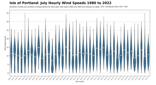
One answer might be to use a summary which is good enough for our purposes. This can certainly be done visually, which I did as part of my attempt to determine whether the wind patterns have changed over the years (a separate but related effort definitely related to this thread's title, though these plots aren't going to be right for testing forecast accuracy, but they might set others thinking). Here is an example for the Isle of Portland. This is a useful weather observation station because (a) it has a long reasonably complete (MIDAS) data set (though they are questions about how the data was collected eg manual vs automatic) and (b) the station is located pretty much in the Channel (see google maps), meaning less but not no land effects. Hourly wind speed is actually the mean wind speed in the period 20 minutes to 10 minutes to the hour (ie mean for HH-20 to HH-10).

These so-called violin plots give a visual impression of the range (top to bottom) and dispersion (width of the 'violin' at each point shows the number of readings at that point) of the wind in July at the Isle of Portland over the last four decades. The first four years (1980 to 1983) do seem to me more sailing friendly, mostly moderate winds (bulges mostly in the 10-15 knot range) but for the rest of the series I can't really say I see a visual trend one way or the other. There may be more Julys with often not enough wind (bulges low down) but the peak (mean not gust) wind speed looks pretty random to me, certainly no obvious trend.
Frank, no need for an immediate response, more important you enjoy the sailing while you can! I'm just filing it here for possible future discussion, if you are so inclined, no obligation.

