SW Sunk swatchway

tillergirl

Well-Known Member
Joined
5 Nov 2002
Messages
8,798
Location
West Mersea
Visit site
With the very kind assistance of Colin (aka Plum), we conducted a survey on Monday 6th May. The swatch works! The old waypoints as observed before also work but some words in a moment.

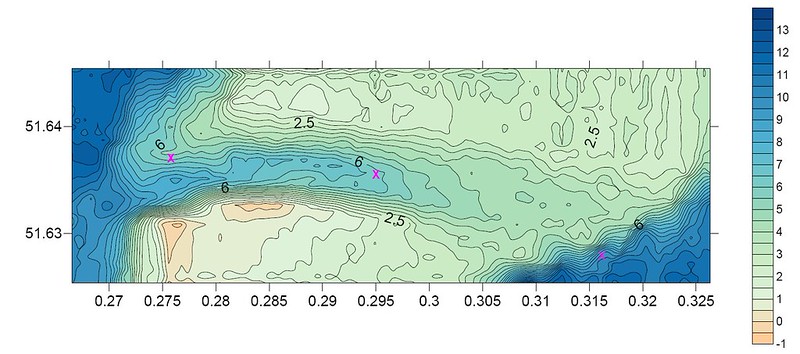
As a general observation, the shape of the swatch is as before. 6 metres or more in the west side but from the midpoint it reduces from 5 metres to largely 4 metres. The shallowest part right at the eastern end of the swatch but you will still find 3.8 metres. But it is clear the swatch has migrated slightly to the north-east. The consequence of that is that although if you were on the rhumb line exactly between the west waypoint to the mid-waypoint you could find the (very steep - no - very very steep!) southern knoll drying 0.8 metres (if the tide were out) only 200 metres away! The width of the swatch has been maintained - just moved a little. So I have recommended three new waypoints and I would recommend that, at low water, sticking to the West to Mid part of the Rhumb line is a good idea.

We were collecting data in last three hours of the flood and we observed that the flood runs hard from the east to the west i.e. from the Black Deep to the Barrow Deep. One imagines the ebb just reverses. The tide running hard bodes well for the retention of the swatch.

You will find the chartlet with waypoint detail at http://www.crossingthethamesestuary.com/page29.html

With thanks from Colin (my boats still in the launching queue)
 
Another vote of thanks to you.
Sitting in my office, this all looks so easy but when it's a bit lively out there with lots of white water, these chartlets are a great comfort.
 
While the short showers prevent me painting...…

SW Sunk computer generated image by Roger Gaspar, on Flickr

This is a computer generated image of the survey. I am not very proficient with the software yet (or ever!) but it says a lot I think. Caution though. The comfuter (sic) decides the contours when there is no data. Frankly this does quite well but I suspect the edge of the Black Deep is more smooth. The three crosses are the 2019 waypoints. Note they are deliberately located to stay away from the steep edges! Note the edges of the Barrow Deep and Black Deep; the latter particularly.

Dan's reference to white water is very relevant at the swatch. Because of the steep edges of the two Deep's even moderate winds will cause some areas of 'disturbance' at the edge of the swatch depending on the direction. Colin and I had one example on Monday where we were coming off the top of the southern knoll. The disturbance wasn't a problem it's just a feature. The waypoints work.
 
Last edited:
While the short showers prevent me painting...…

SW Sunk computer generated image by Roger Gaspar, on Flickr

This is a computer generated image of the survey. I am not very proficient with the software yet (or ever!) but it says a lot I think. Caution though. The comfuter (sic) decides the contours when there is no data. Frankly this does quite well but I suspect the edge of the Black Deep is more smooth. The two crosses are the 2019 waypoints. Note they are deliberately located to stay away from the steep edges! Note the edges of the Barrow Deep and Black Deep; the latter particularly.

Dan's reference to white water is very relevant at the swatch. Because of the steep edges of the two Deep's even moderate winds will cause some areas of 'disturbance' at the edge of the swatch depending on the direction. Colin and I had one example on Monday where we were coming off the top of the southern knoll. The disturbance wasn't a problem it's just a feature. The waypoints work.
Very nice, but you are right to point out the problems of automated contour generation. As you say, the "scalloped" edge of the deepwater is likely to be due to iregularities in the data distribution. It's helpful in cases like this to overlay the actual data points (or survey lines) on the plot - that will highlight artefacts like that.

Soundings are especially problematic with contouring algorithms, because they are usually gathered along survey tracks, and are much more closely spaced along the track than the track spacing. This results in the kind of problem you are seeing. Another common artefact is "sausage strings" of isolated loops along a survey line.

PS, If you need help with this kind of thing, geographic Information systems and spatial data (including bathymetric data!) were my day job for many years.
 
Thanks. I have always preferred 'drawing' but I do use the software first to provide a quick profile and overview to look for surprises and a strategic appreciation of what has been happening. It was fairly obvious during the collection of data that the eastern side had improved - albeit not a lot but by the time we had finished I thought it flatter and a little deeper. The value of the computer generated chartlet first was the obvious migration to the north-east, second the retention of the good depths on the west side, third confirmation of the broader 'plateau' on the eastern side. And as my drawing appears I can and do refer back to the computer image.

I thought I would show the computer image because of the steep edges on this occasion. I don't think I have shown any of the other surveys. I thought on this occasion that it was useful not just to suggest peeps stay away from the southern knoll but to notes the edges of both ends of the swatch. It is most obvious on the Black Deep side but both applies. Depths in to the Deeps drops like a stone - indeed like a Mi Amigo. It founded on the Long Sand and then slide down the side of the Long Sand to the edge of the Black Deep. If the wind is 'on-swatch', the water on the edge of the swatch can be 'interesting'. It wouldn't be dangerous in reasonable conditions but can be 'discouraging'. For example approaching from the Black Deep with a brisk south-easterly the water on the edge of the swatch might initially look like a place not to be but it would be fine. On the day we faced coming to the west over the southern knoll with nothing less than 3.5m of water. Along the edge of the knoll there was a lot of white water and agitated waves. But it was fine.

I appreciate the software wants more data but as amateurs we were limited for time and data. Mind you we collected 8546 relevant soundings which I think sufficed for the drawing. What does bug me is how the software peeps created the algo that creates scallops. Why wouldn't the algo draw a more relevant suggestion between the data?

I am not sure if the computer generated image can be developed. The first thing needed would be a full pattern of soundings right across the rectangle area. I reckon that would take up 6 hours and that would present some practical difficulties. Overlaying degrees and decimal minutes would be easy. A classed post map might be useful, indeed if I have time I will have a go so if you have any suggestions for developing a useful product it would be helpful. But in the meantime I hope the drawing suffices.
 
Top