The F word

Colvic Watson

Well-known member
Joined
23 Nov 2004
Messages
10,862
Location
Norfolk
Visit site
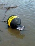
A while ago there was a photo on the forum of a buoy in the mud with the sign saying "danger deep water" or something. At the time some of us thought it would make a great burgee. So how about an iconic image rather than trying to beat letters which will look odd on one side? Personally I like the coastline by itself without any words or letters, it sort of says what it is.
 

LittleSister

Well-known member
Joined
12 Nov 2007
Messages
17,646
Location
Me Norfolk/Suffolk border - Boat Deben & Southwold
Visit site
A while ago there was a photo on the forum of a buoy in the mud with the sign saying "danger deep water" or something. At the time some of us thought it would make a great burgee. So how about an iconic image rather than trying to beat letters which will look odd on one side? Personally I like the coastline by itself without any words or letters, it sort of says what it is.

Danger Deep Water.jpg

Exactly what I was going to say. . . .


until I caught up with the whole thread. I like 29.1, like the 'not to be used for navigation', in two minds about the 'ECF', and quite like the idea of no lettering, too (which would simplify production, apart from the aesthetics).
 

Tradewinds

Well-known member
Joined
12 Jan 2003
Messages
4,023
Location
Suffolk
Visit site
Very good.

My version

ecf_flag3v2.jpg


No real problem with the reversal of lettering too :encouragement:
 

Habebty

Well-known member
Joined
16 May 2001
Messages
4,460
Location
Norfolk/Suffolk
Visit site
It's aground of course!!

Or it's an ad for ecstasy ( get your e's here :) )

Actually I like them both, a few more suggestions and we should give all the suggestions an id number for a poll?
 

LittleSister

Well-known member
Joined
12 Nov 2007
Messages
17,646
Location
Me Norfolk/Suffolk border - Boat Deben & Southwold
Visit site
I think the blue and the brown, horizontally split, works well together in #75, and is distinctive as few burgees use brown.

I think it would interesting to see a version with the coastline (might have to adjust the land colour), as per those in #27 or #29, but with the blue and brown horizontal split sea area, but I don't have the skill/kit to produce one.

p.s. Why are we worrying about the lettering being reversed, but not the coastline?:)
 

Koeketiene

Well-known member
Joined
24 Sep 2003
Messages
17,752
Location
Finistère
www.sailblogs.com
Very good.

My version

ecf_flag3v2.jpg


No real problem with the reversal of lettering too :encouragement:

I like it. Simple & distinctive :encouragement:

On second sight, might I suggest a minor change?
Could we have a compass rose that reminds me less of work?
Ta much

NATO-Logo-for-website-page.jpg


Knew it looked familiar. :eek:
 
Last edited:
Top